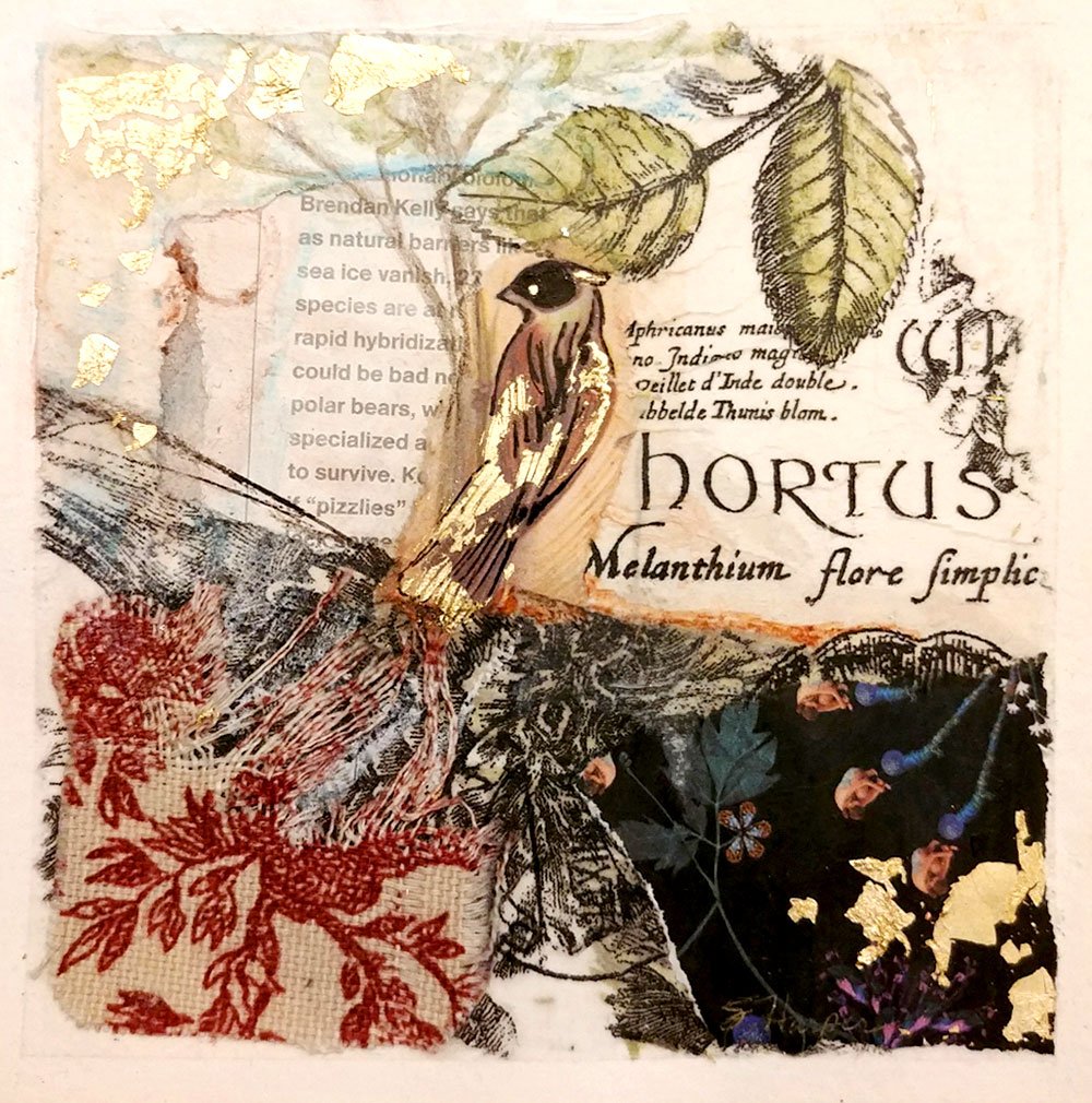
Student Gallery
student art
from the abstract color challenge!

Hello my artsy friend!
I love love LOVE what the participants have been creating in the Abstract Color Challenge! Today is the last day, so let’s celebrate!
A big THANK YOU to everyone who sent me their photos. Below are some of the (hundreds of) pictures you guys have sent me: a whole rainbow of new possibilities! I couldn’t possibly include them all here, but please know that even if your art didn’t get featured, I did see everything you sent and I so appreciate your participation.
Now let’s explore these yummy colors one by one! Let them inspire you, and I’m sure they will make you want to try even more colors and color combinations.
“What I really loved about the Color Challenge was how fast and joyful it was to learn an approach and techniques that inspired me to create rich, beautiful abstract landscapes in just a few hours time, using a few basic supplies and pieces of magazines. Warning… it’s contagious, I just want to create more and more!”
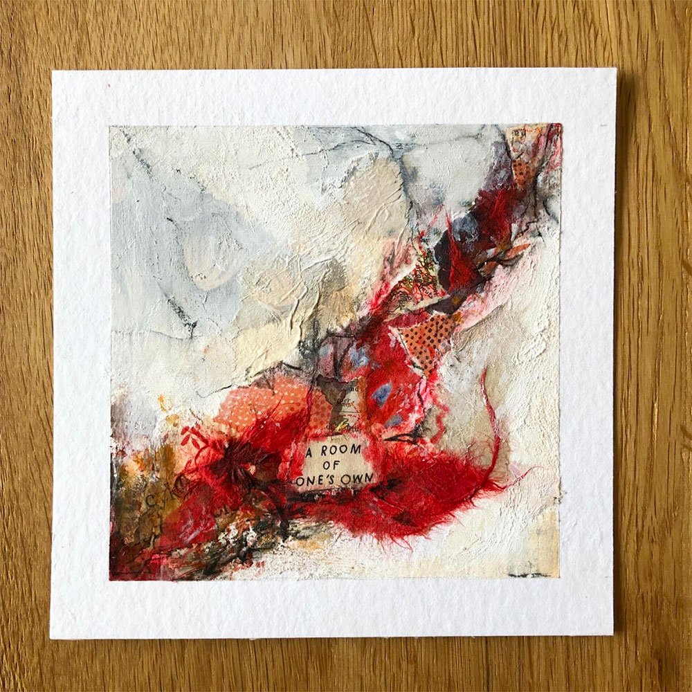
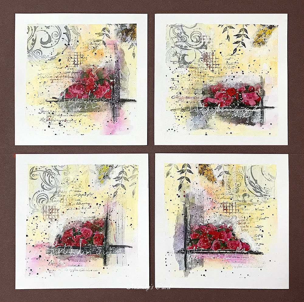
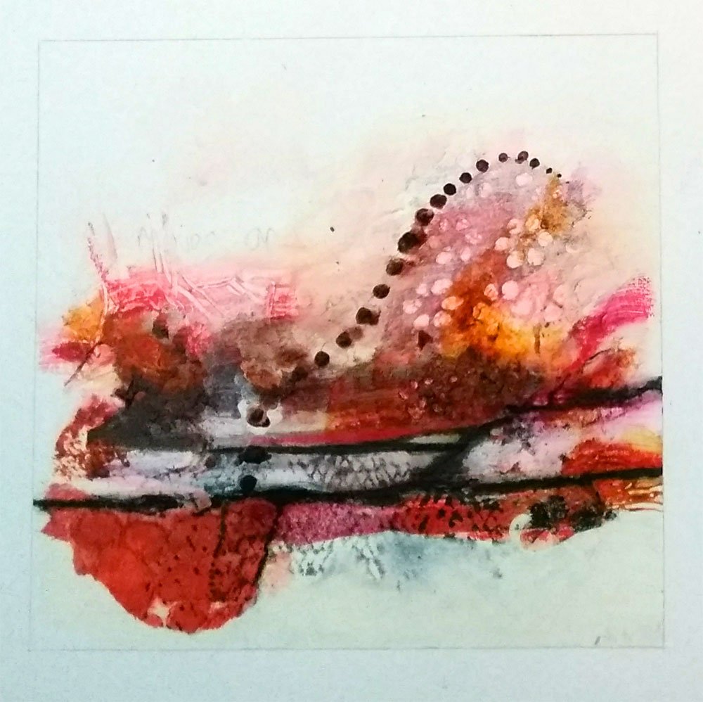
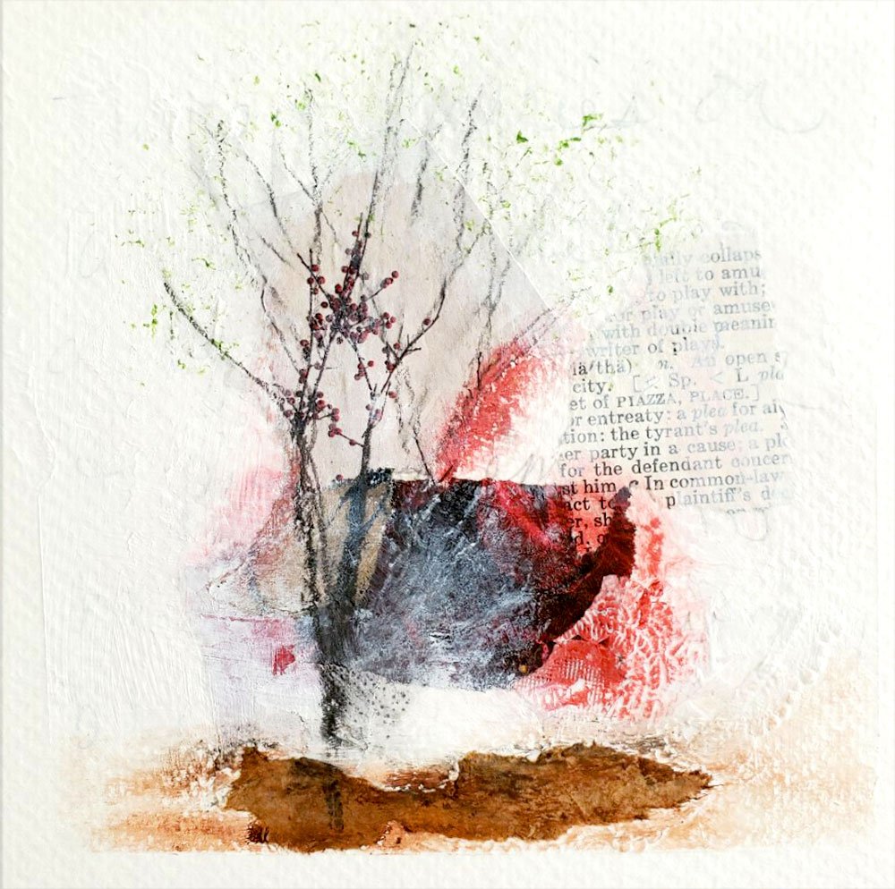
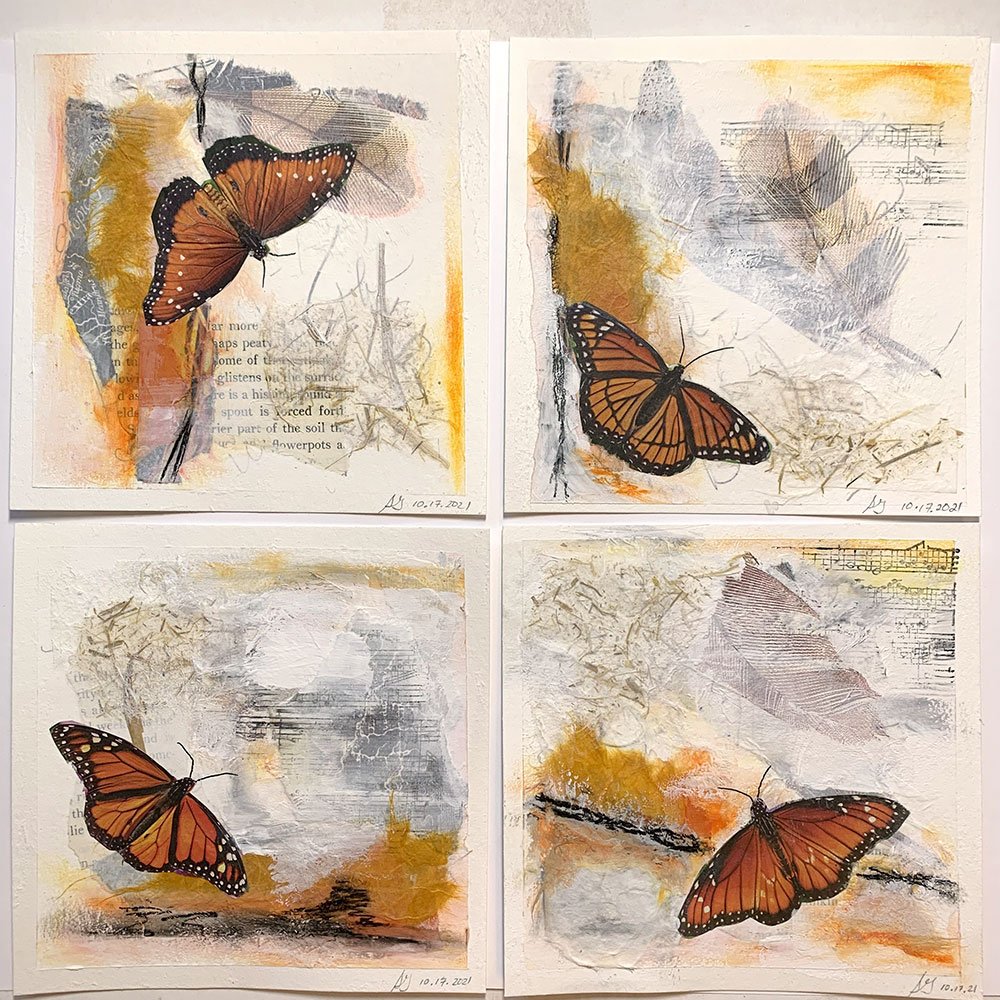
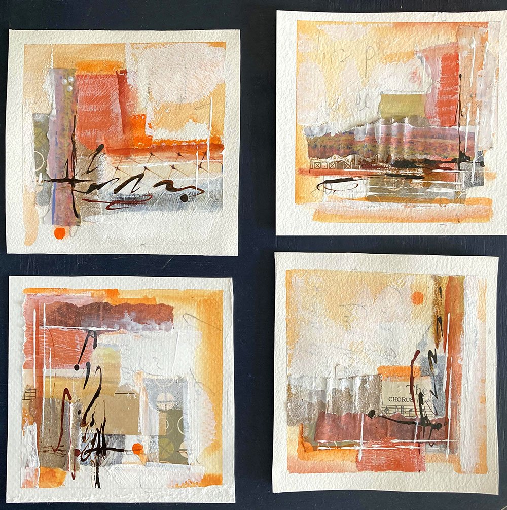
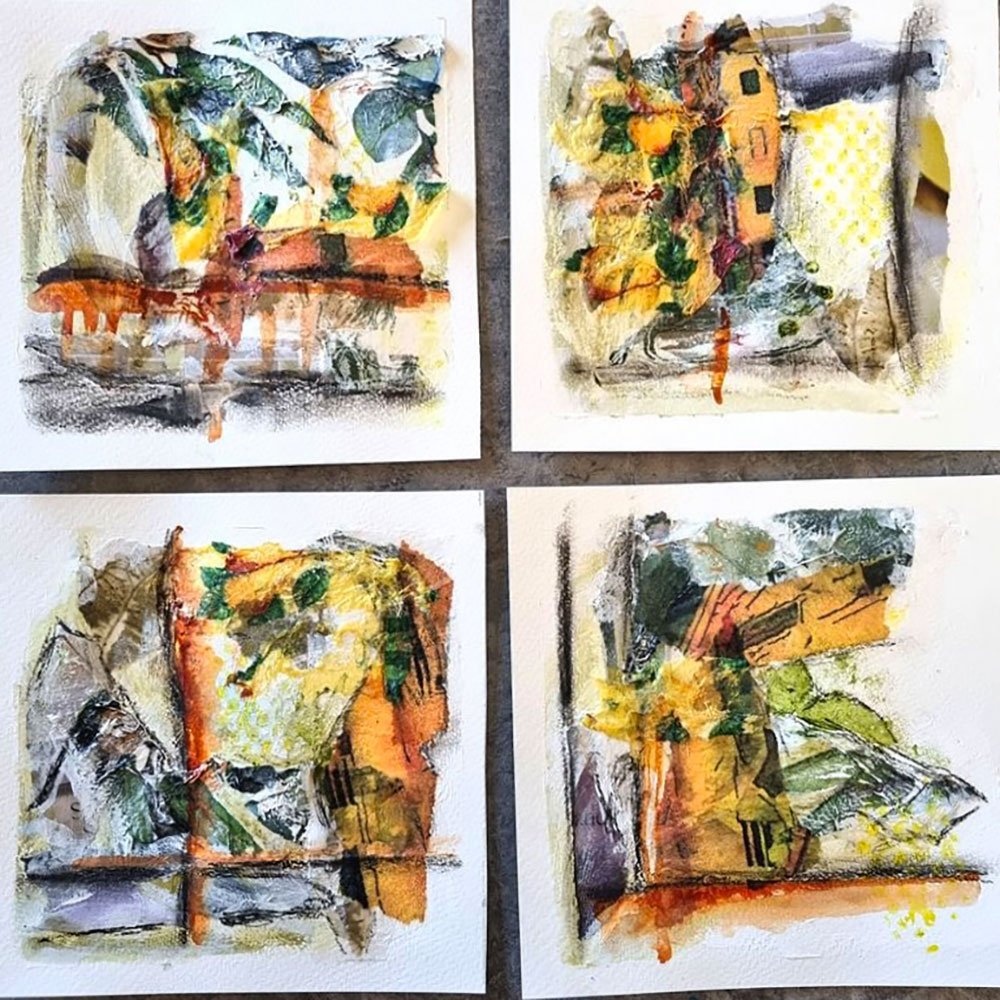
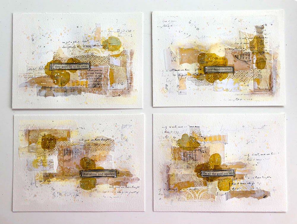
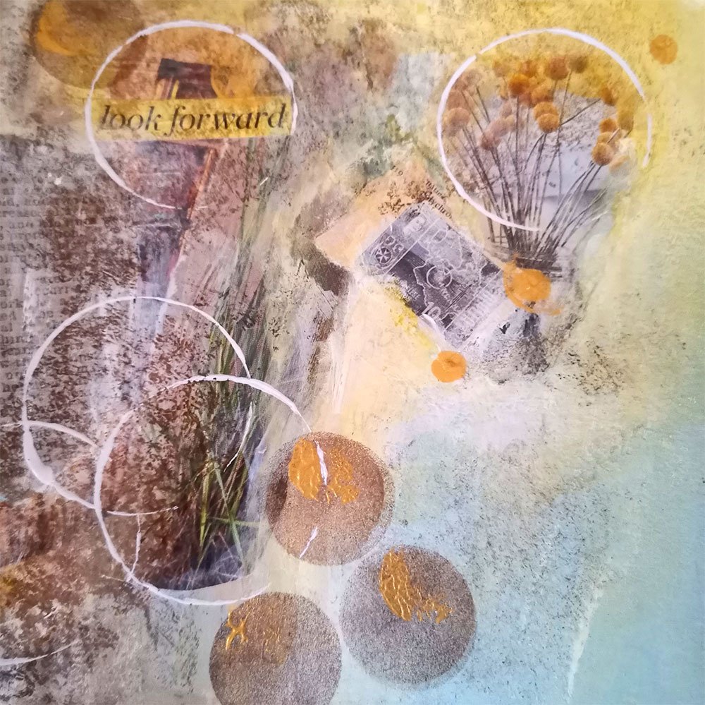
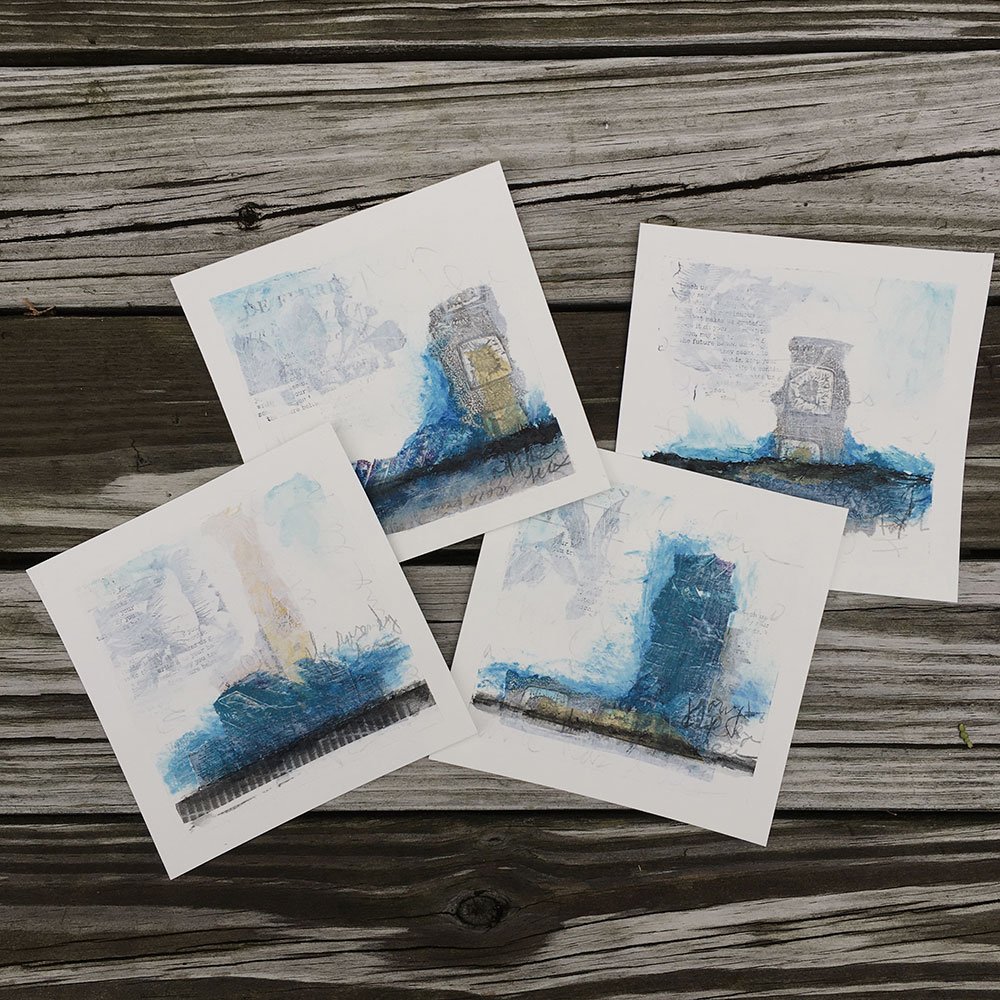
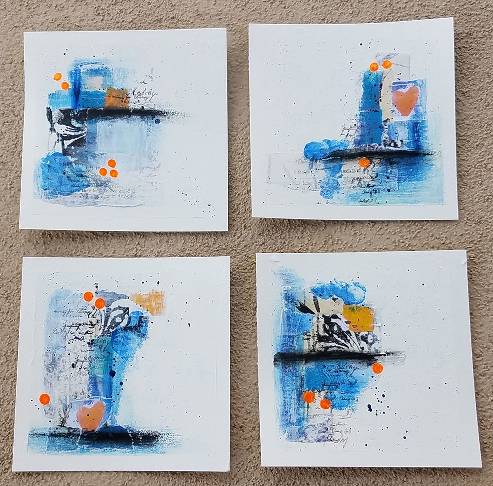
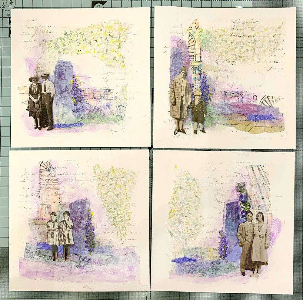
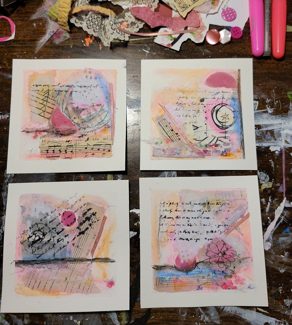
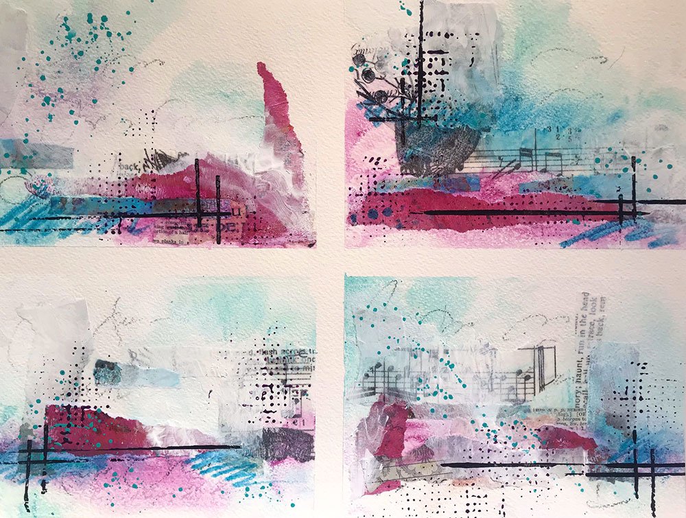
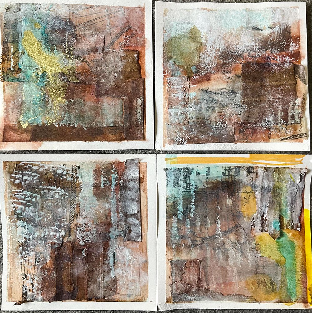
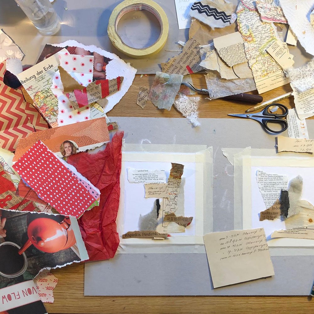
Red was the color I demonstrated in the workshop: it’s so rich and deep, but to me it can get overwhelming very quickly! And it seems I’m not the only one, because many of you chose this color too. Some reds are cooler, leaning towards magenta, and others are warmer, especially when combined with rusty, orangy tones. Take a look:
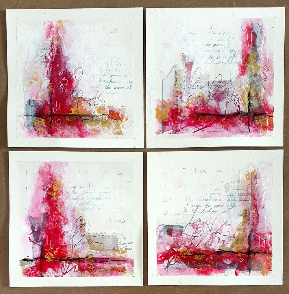
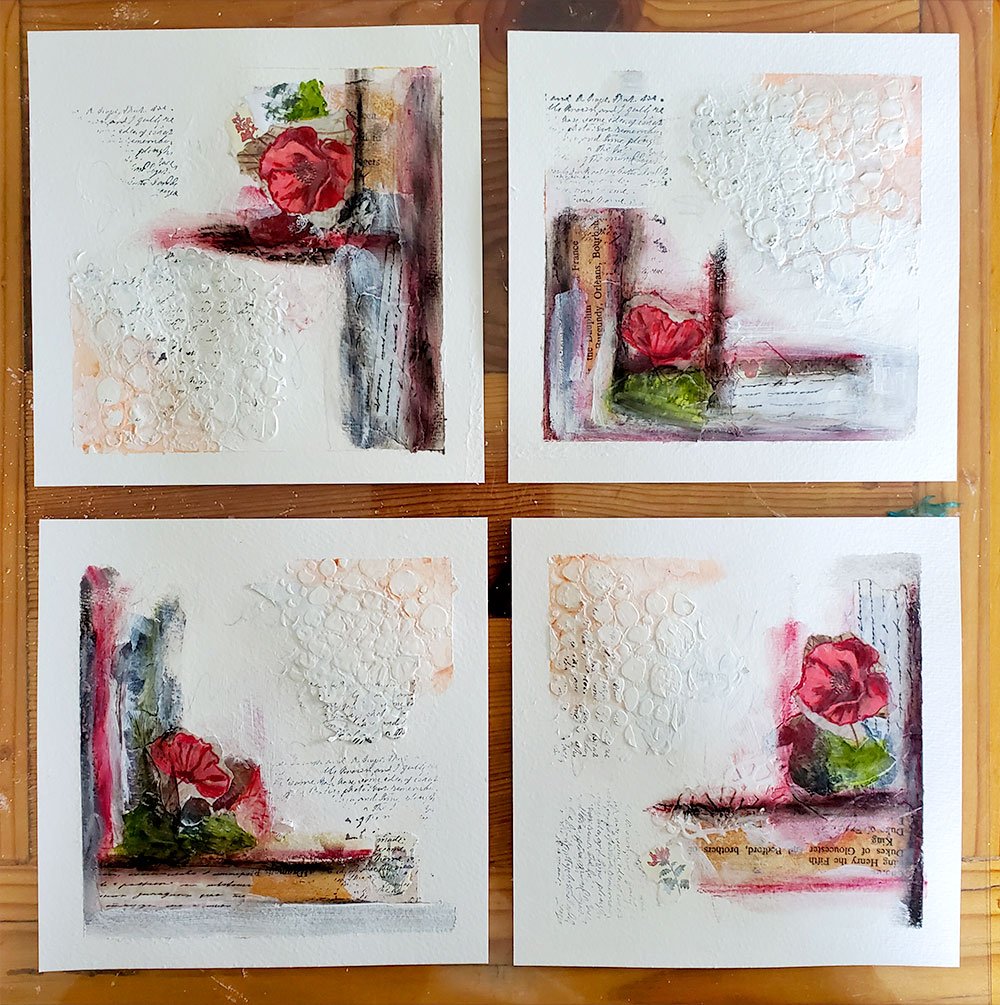
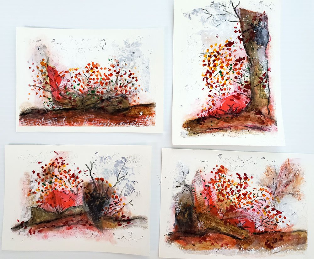
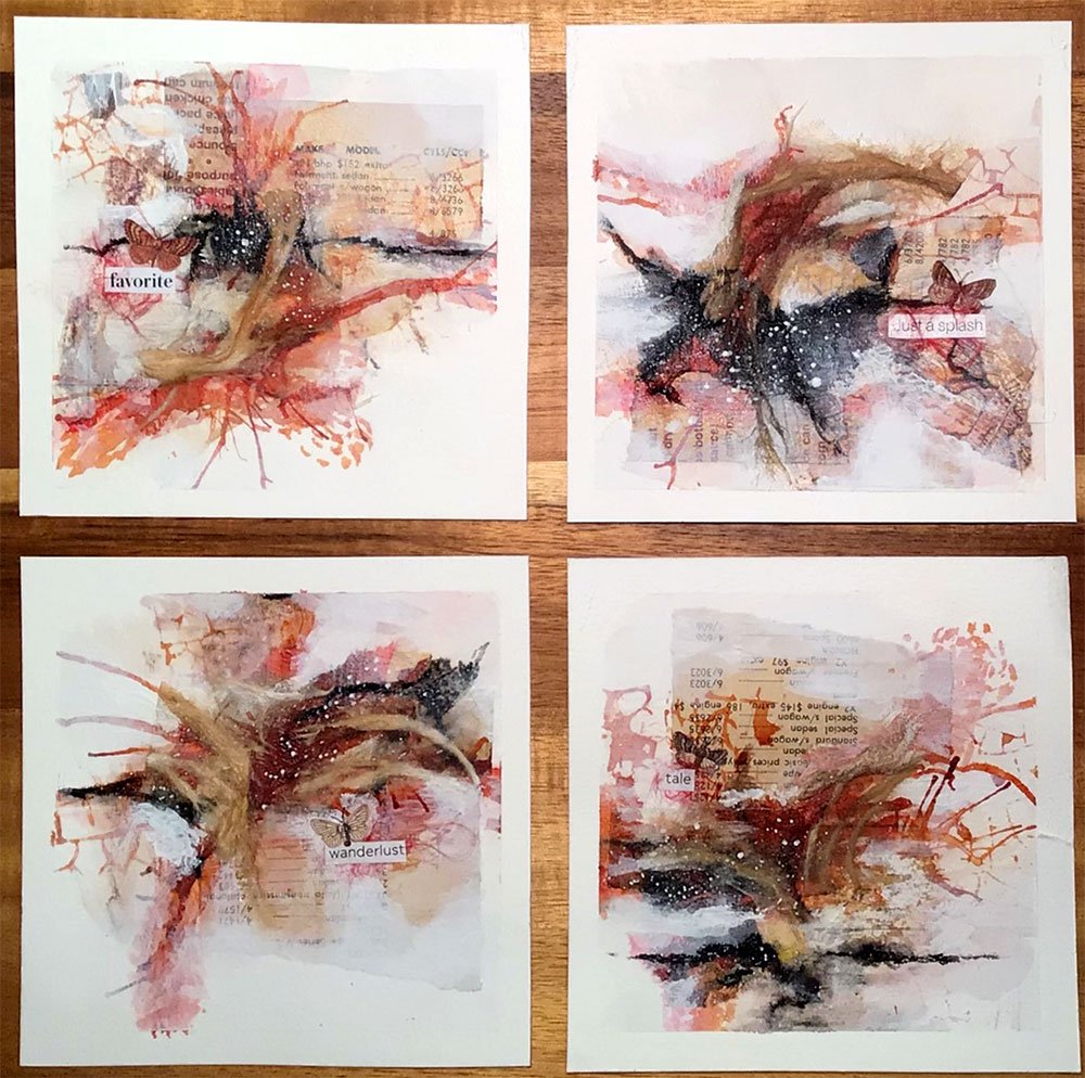
“My color was red. Since I love but fear yellows too, I pulled in some Quinacridone Gold. I wish I had more time to work on these because, although they are a little rough, I’m really enjoying the reds and yellows nestled in with the neutrals and black. I mean, I’m seriously starting to love where this is going. I’m inspired to work on a larger painting with this palette!”
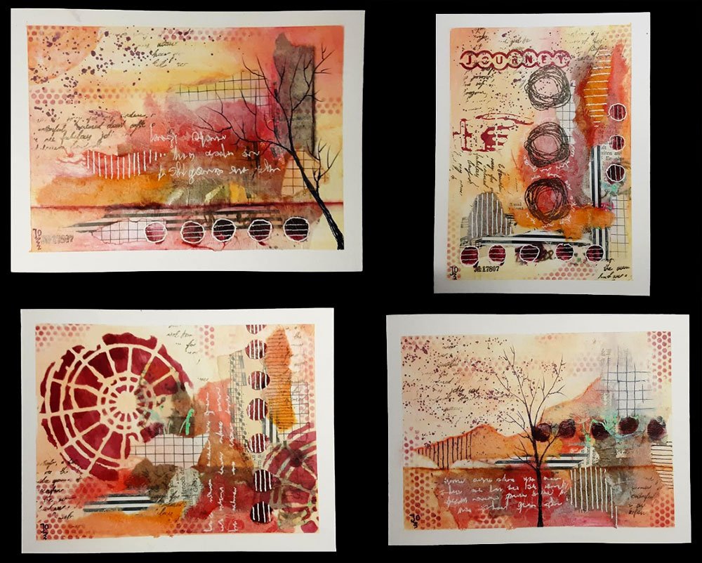
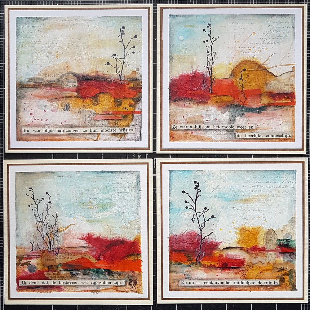
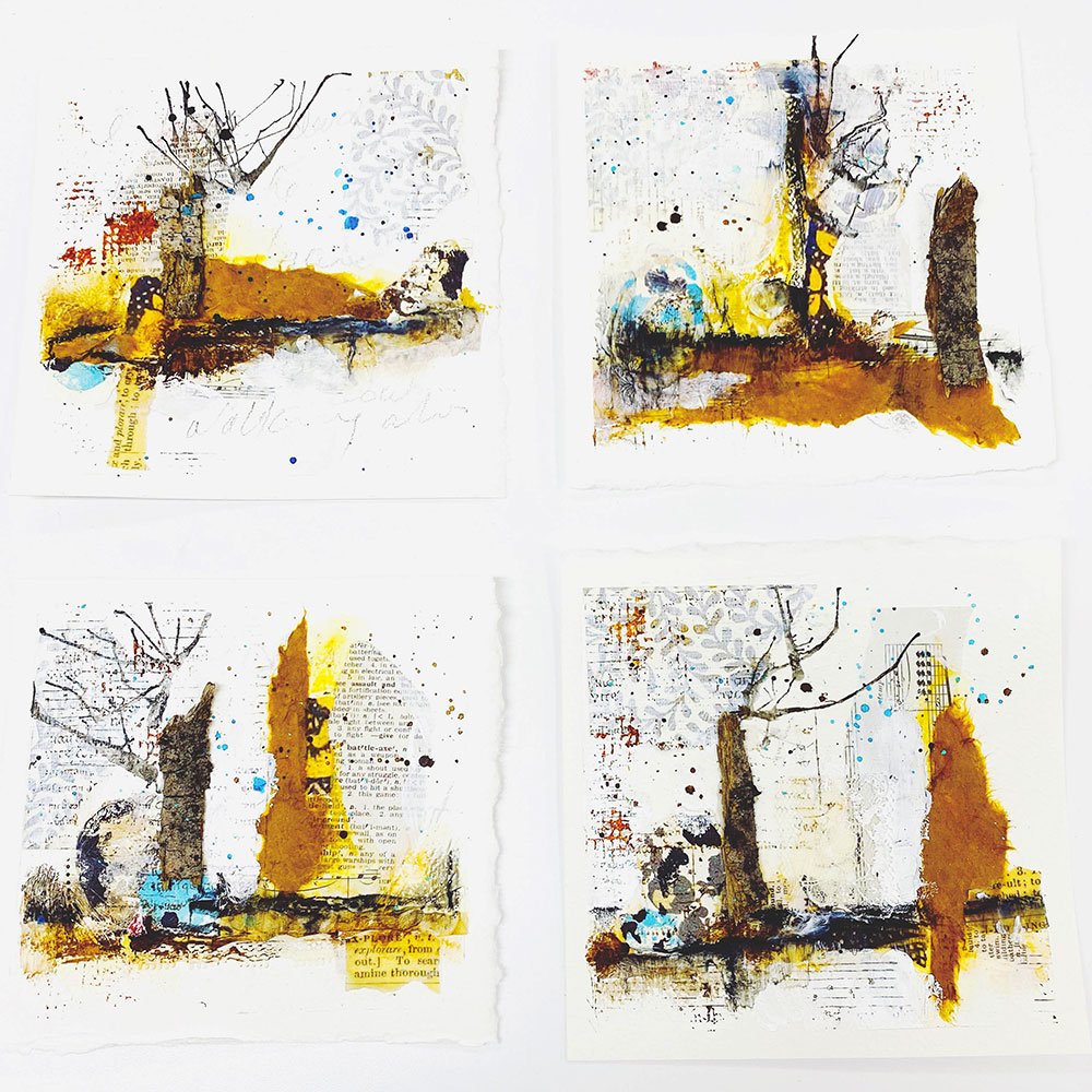
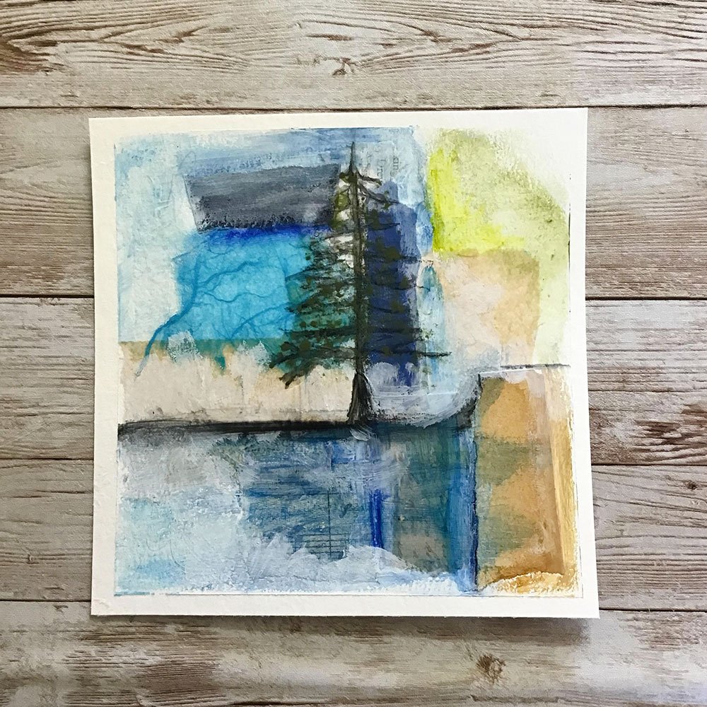
Next in the rainbow is orange! Quite a few of you explored this color family, including rusty colors like burnt sienna. Well done!
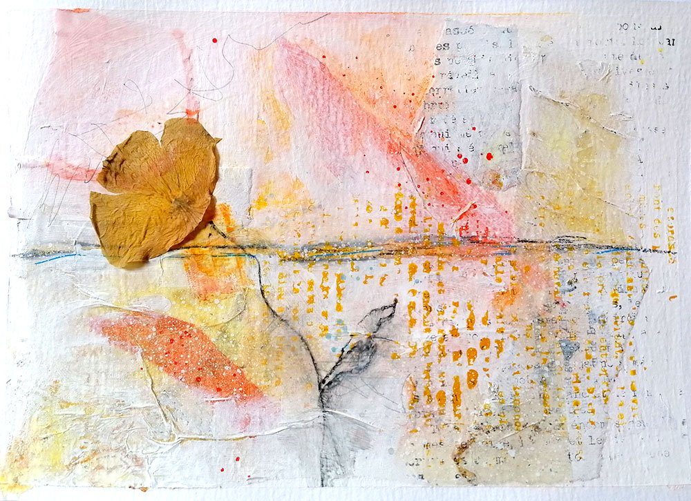
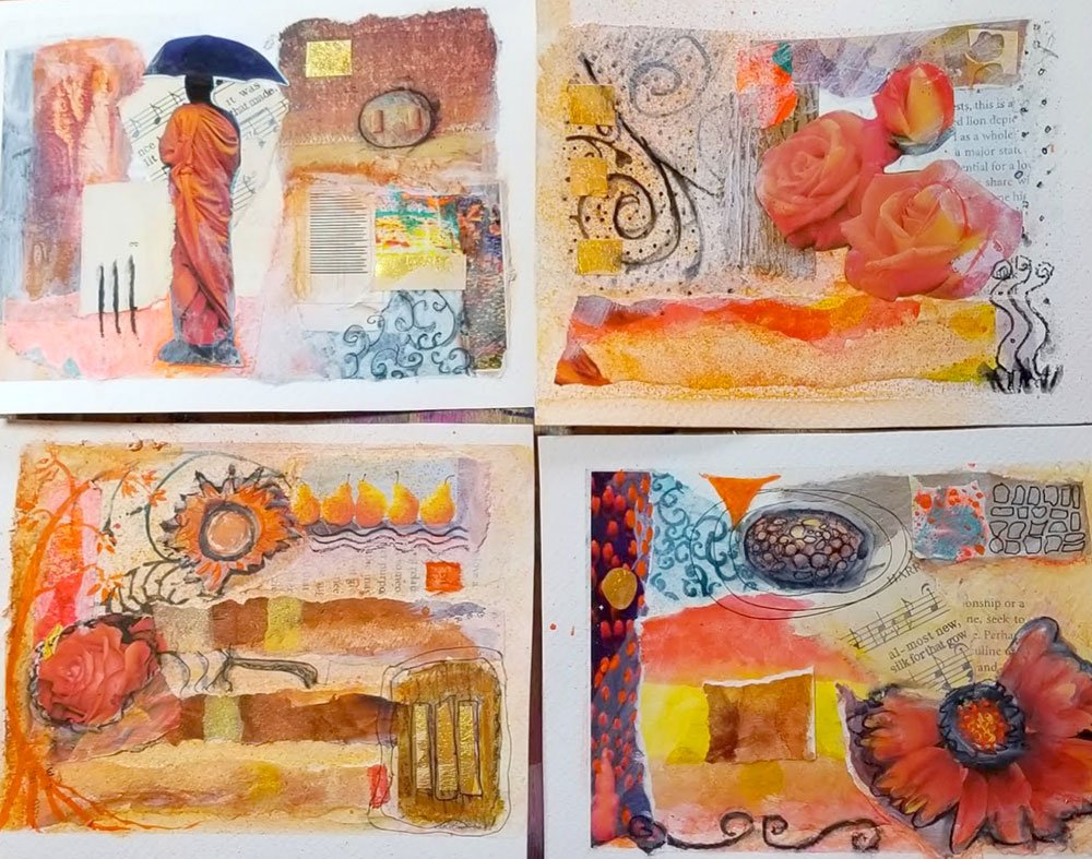
“I loved the process of being overwhelmed with the colour but knowing I could dim it down to my liking without getting rid of it completely. I would never have thought it was possible to have bright orange feeling as it is soft”
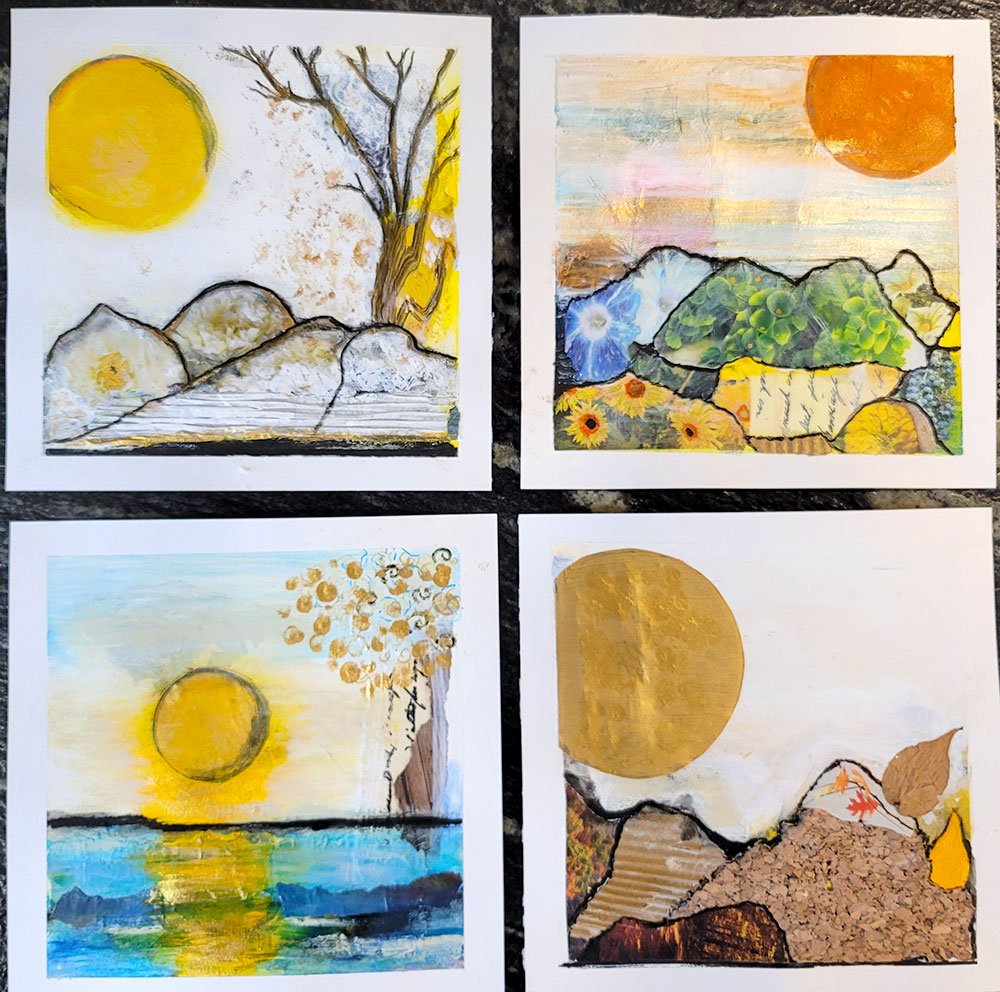
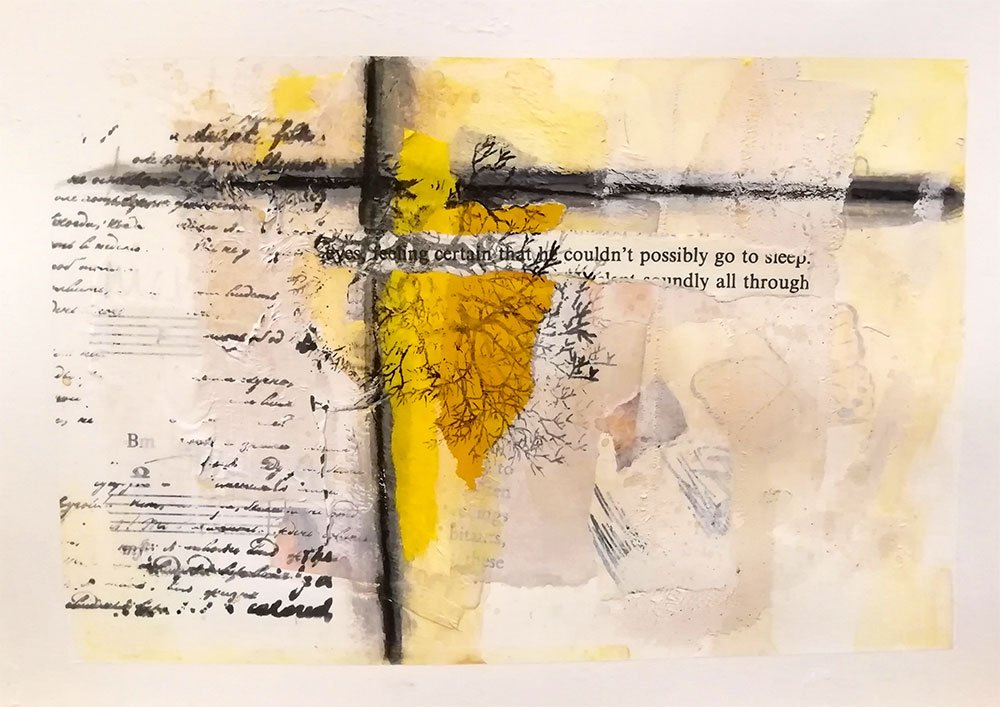
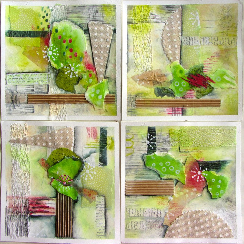
Just like red, yellow can be super bright and often feels overwhelming to me when used in larger amounts. But I love how some of you have given it a softer edge, keeping it airy and uplifting. You inspire me!
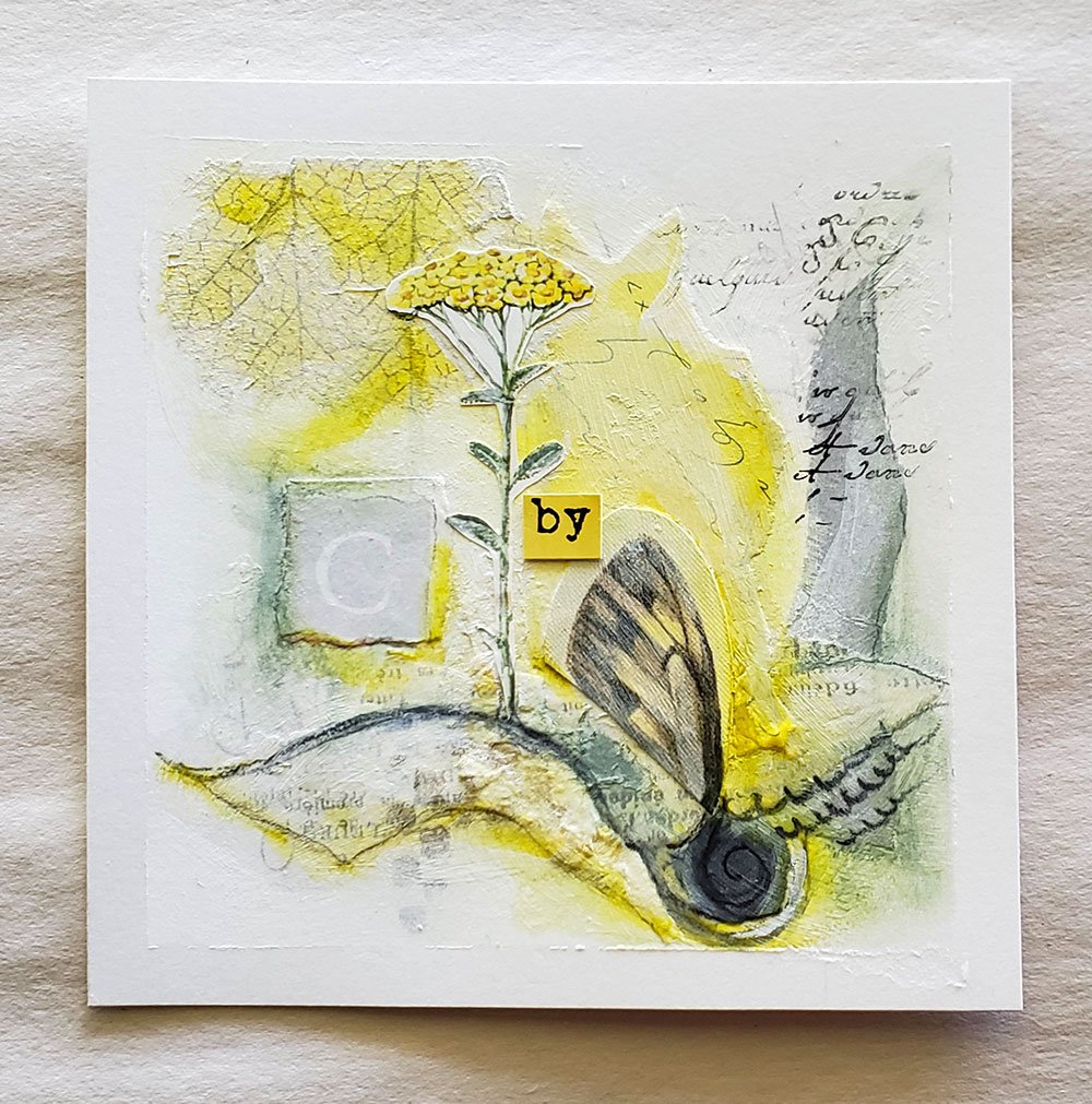
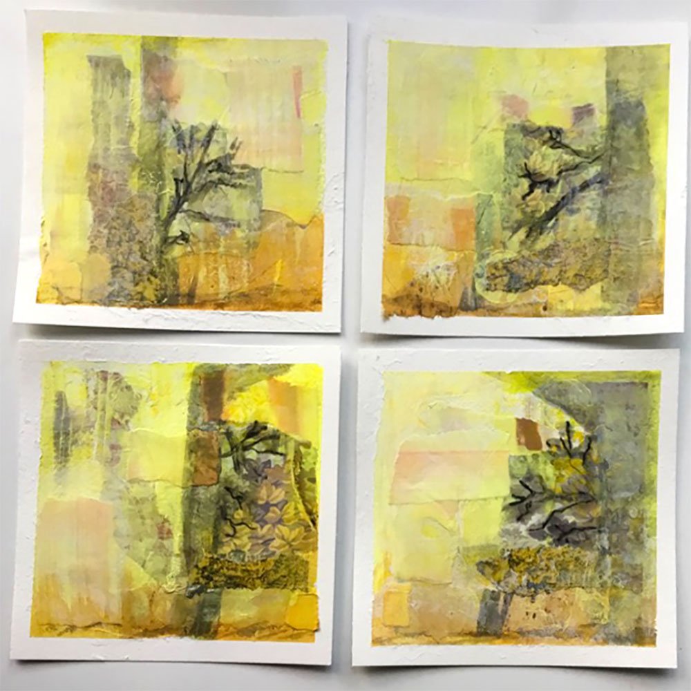
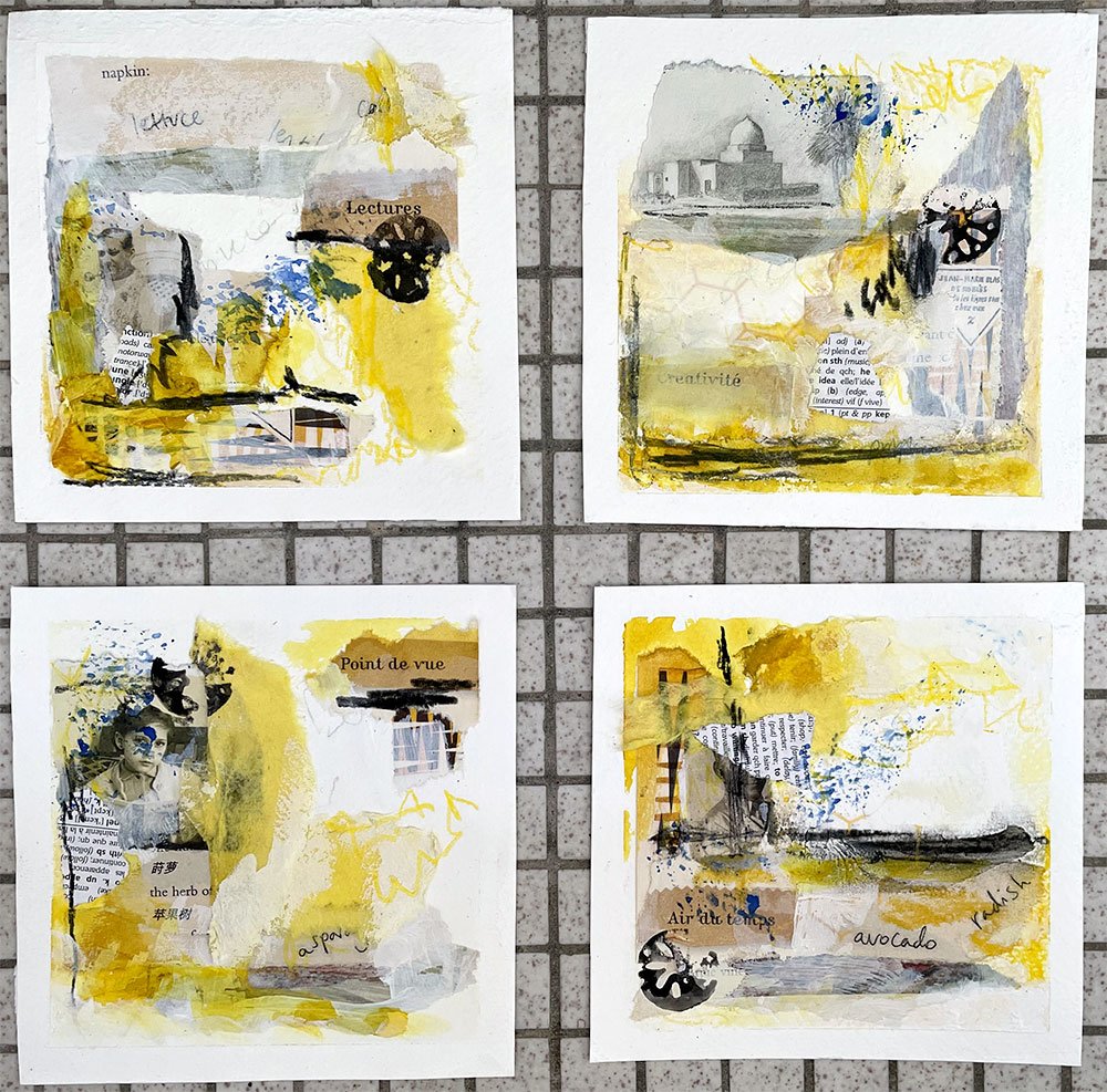
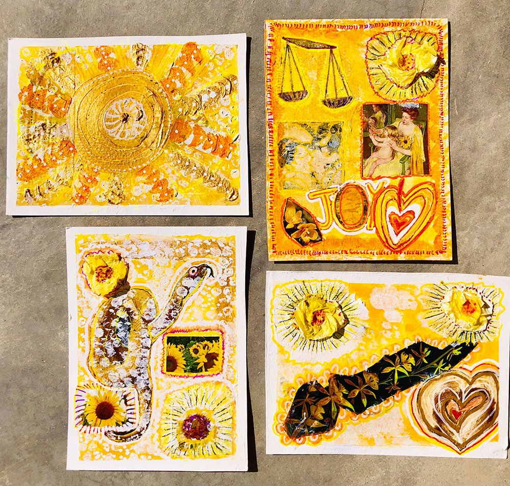
“The thing I enjoyed most about the course was pushing beyond my colour comfort zone and even though the pieces went through a phase where I didn’t like them, I was happy with the overall result! ”
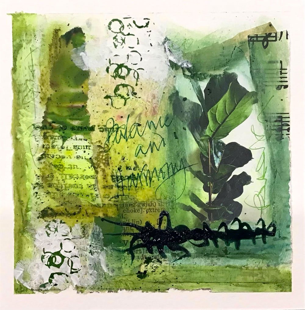
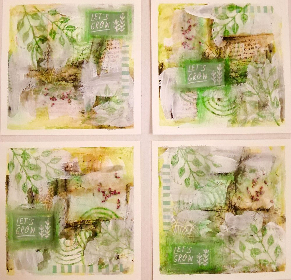
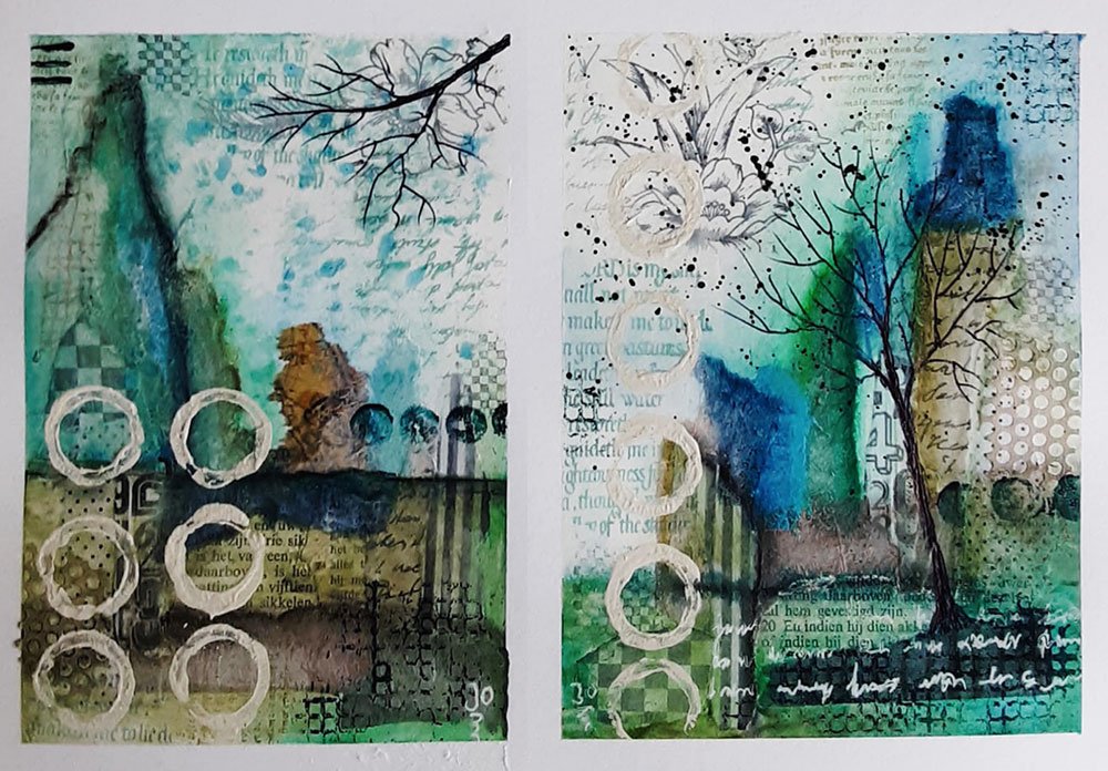
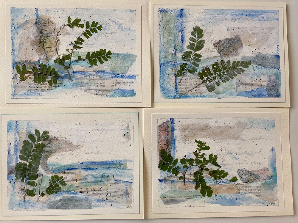
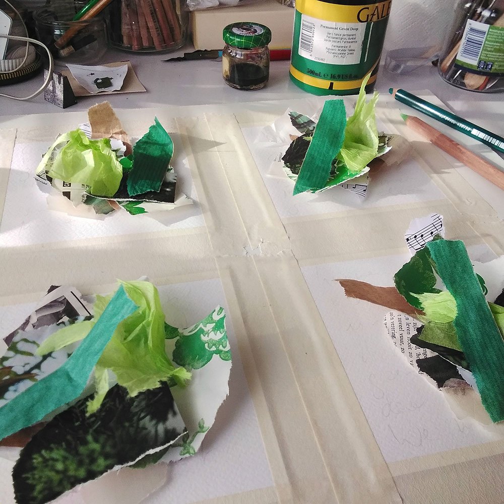
Green is a color family that comes naturally to me, so it was really interesting to see that so many of you chose it for the challenge! I hope it helped you make friends with it. Green can be such a delightful, soothing color to use in your art. It’s the color of nature!
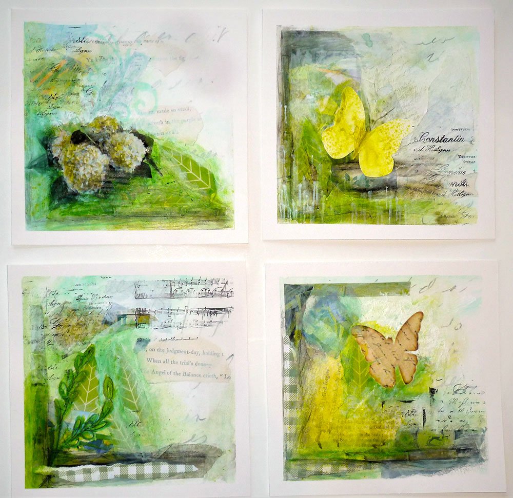
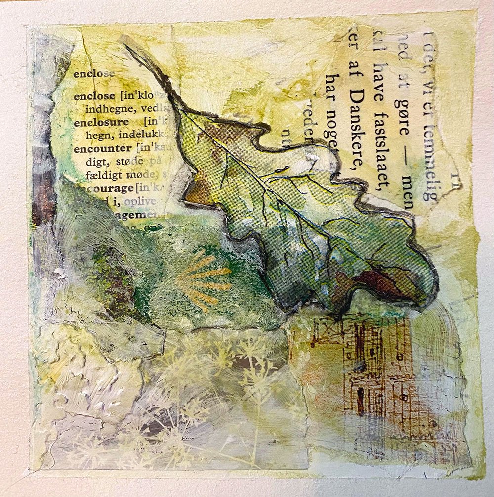
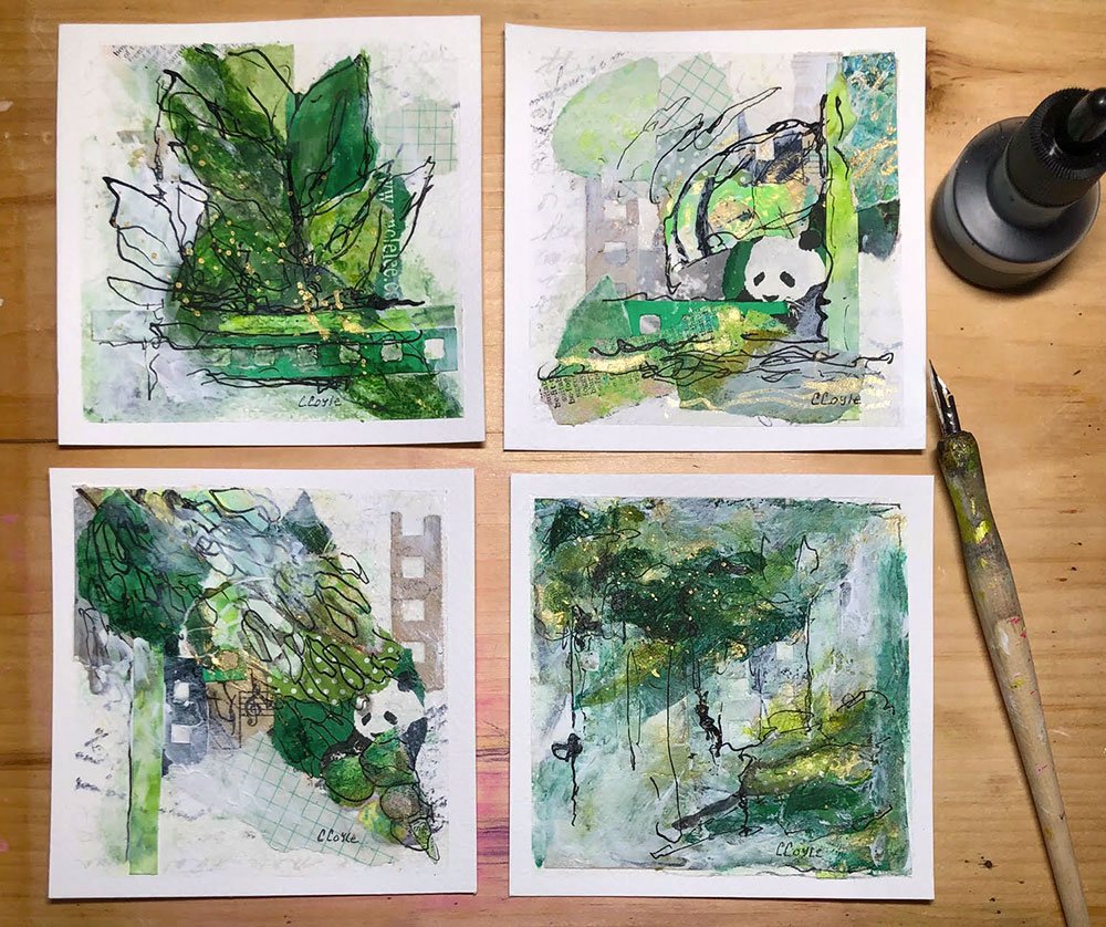
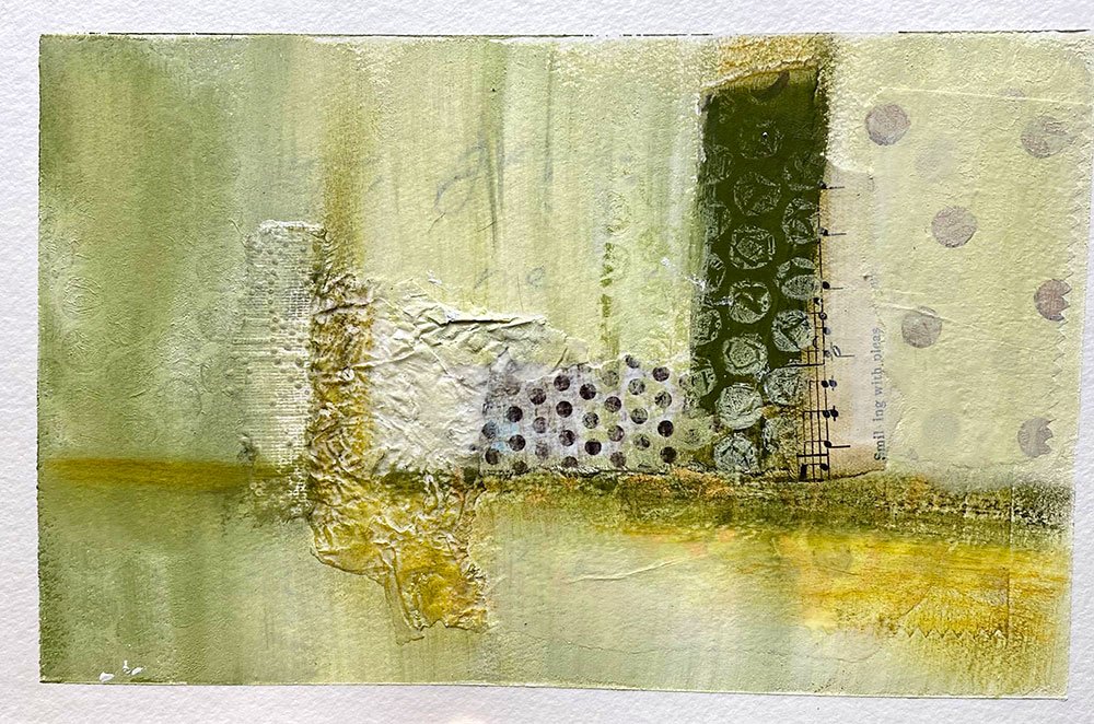
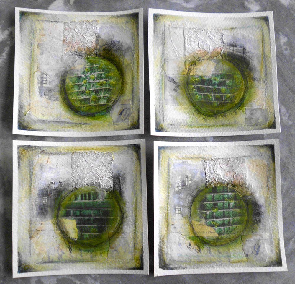
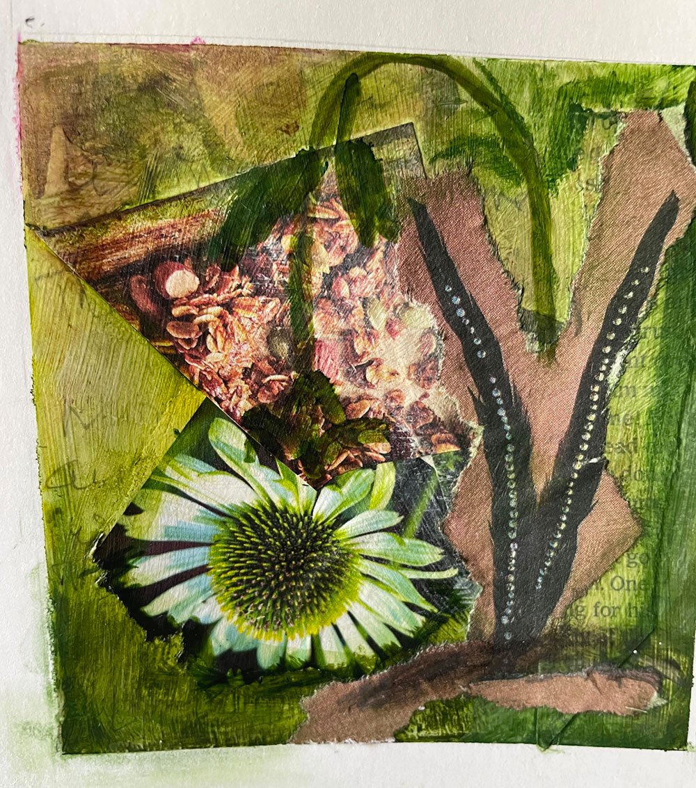
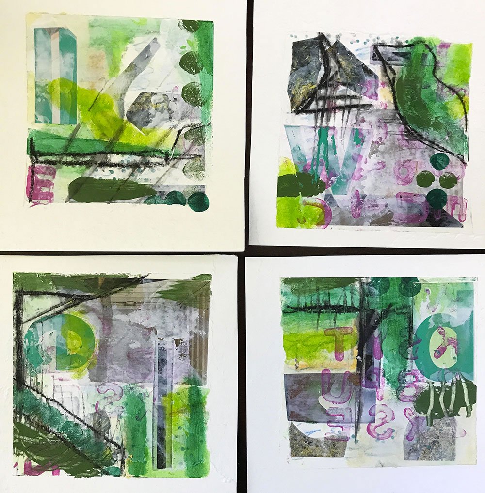
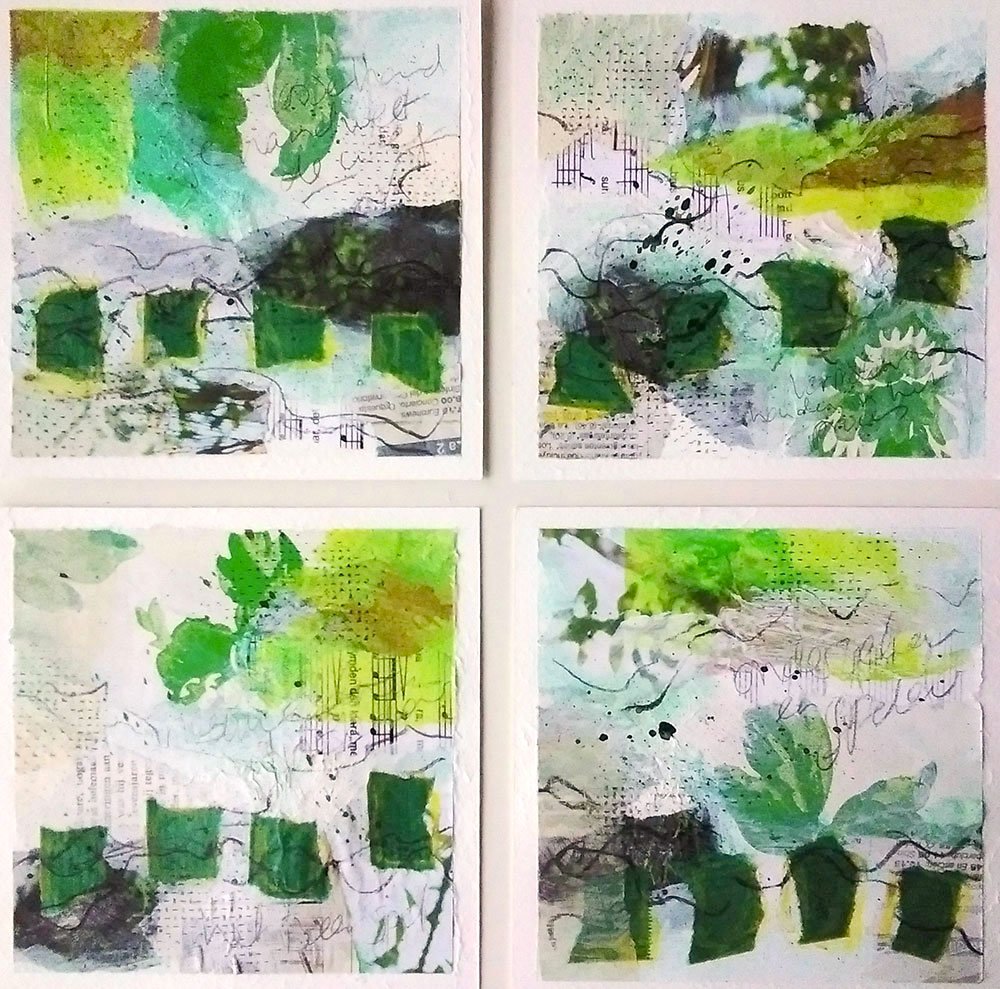
“I love gathering the collage materials. And then you step into another world, the world of the color you choose. I really love the color green!! But nevertheless it was a challenge. And once you started, you can’t stop!”
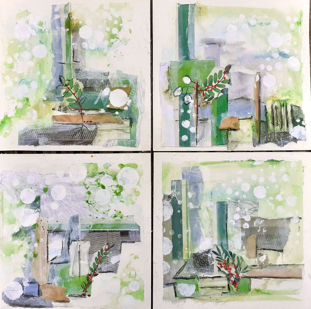
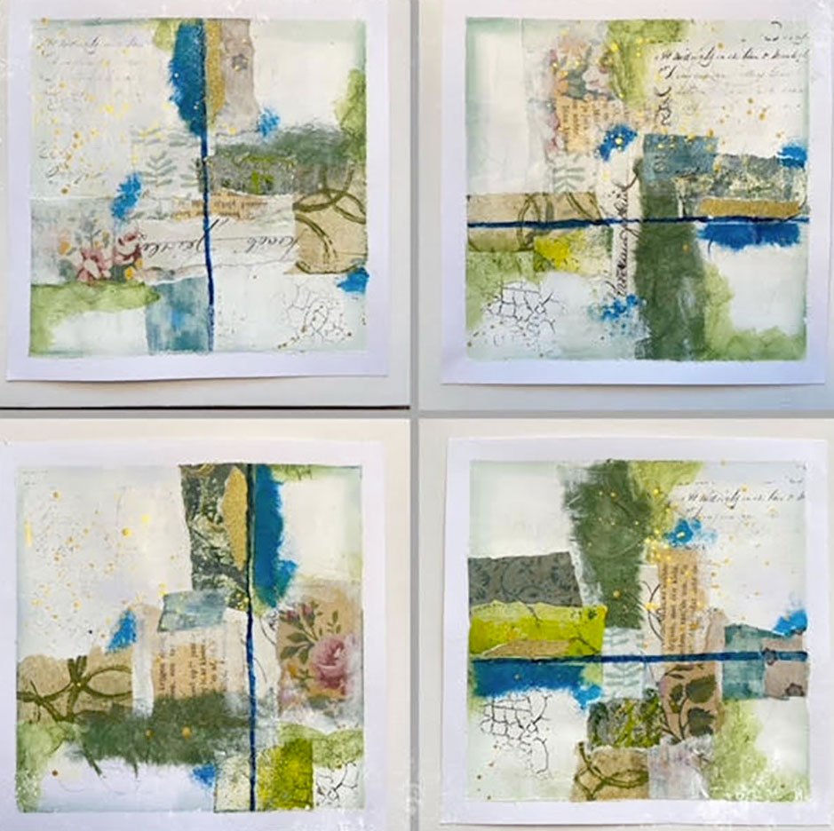
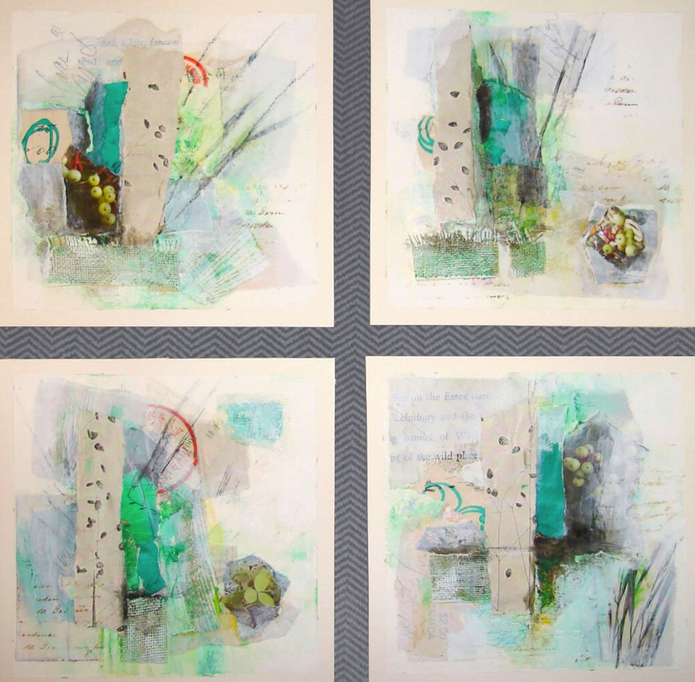
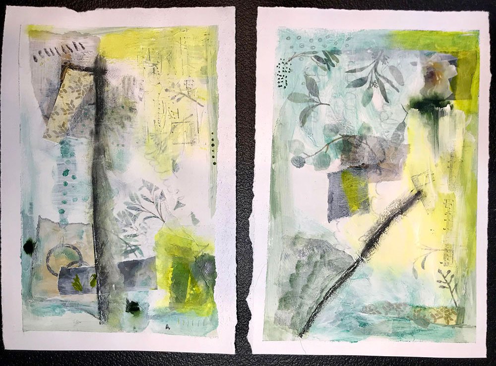
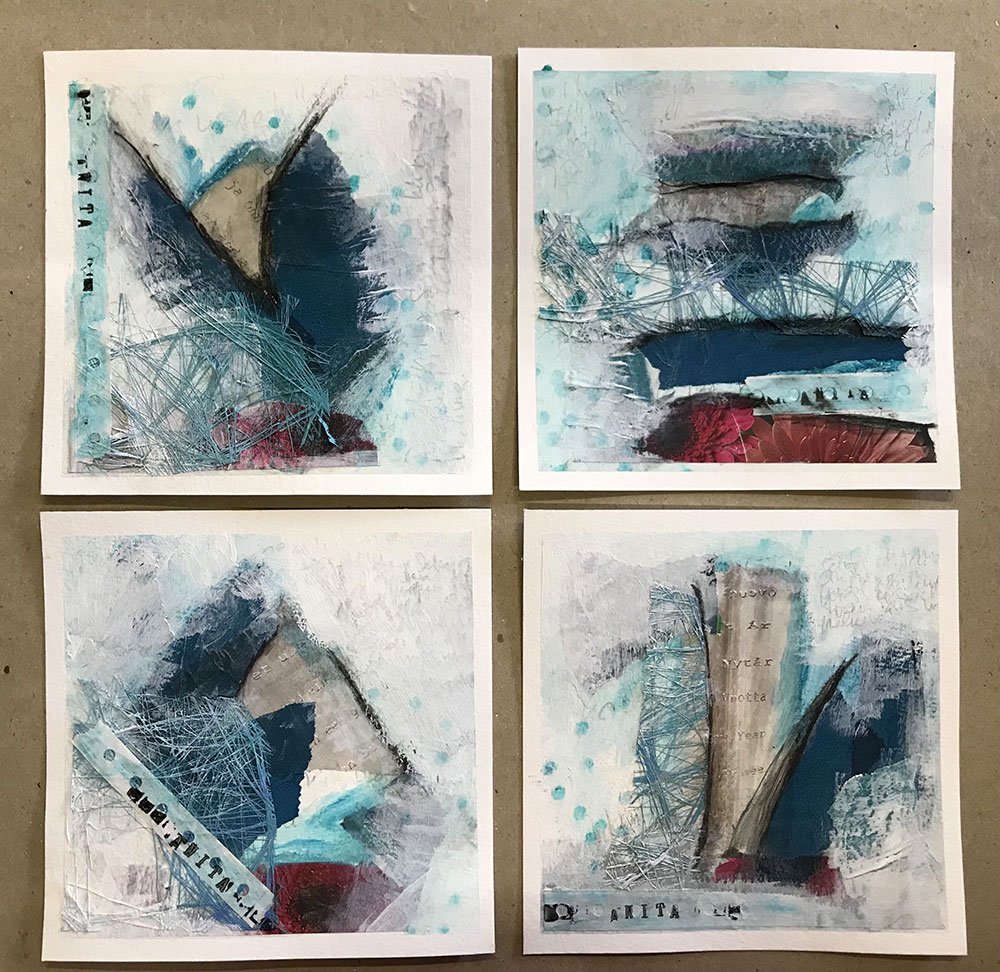
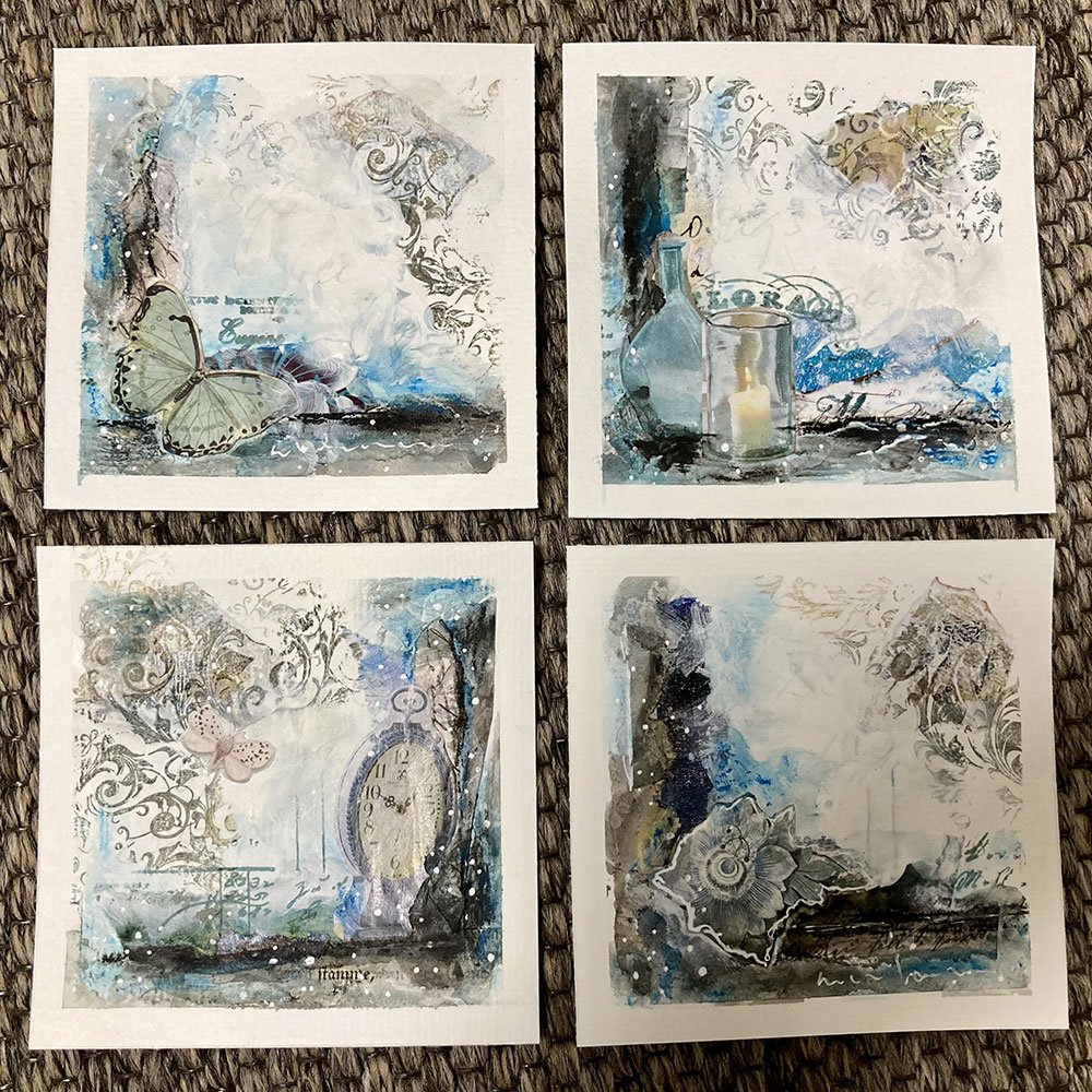
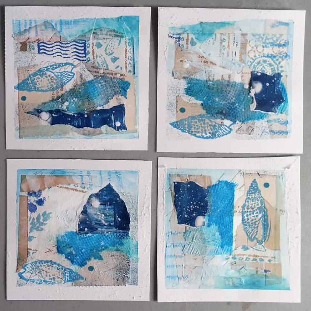
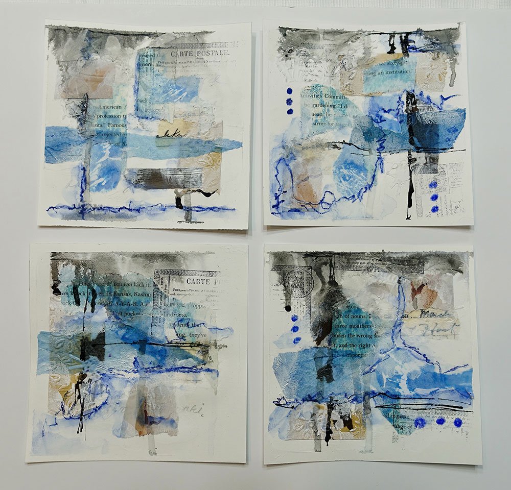
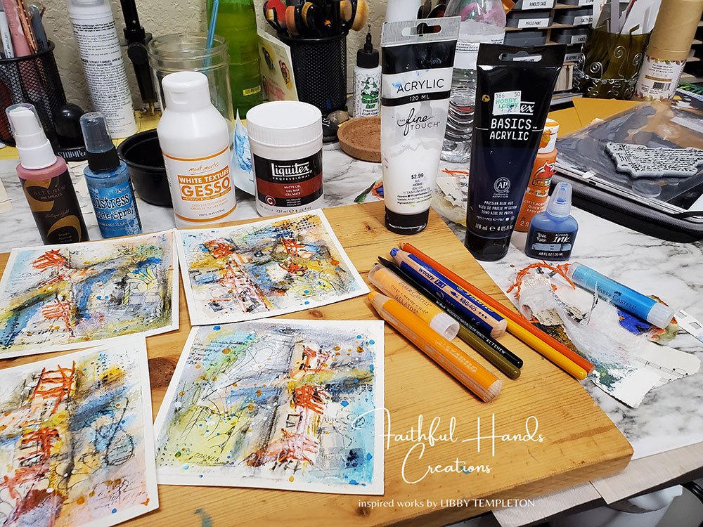
There are so many different kinds of blue, and looking at all these mini artworks, I realize that I’m very comfortable with those that have a hint of green, like turquoise, or that are more neutral, like Payne’s Gray. But I’m a lot less comfortable with Ultramarine and other intense blues. Maybe something I should explore!
“What I enjoyed most was learning not to think so much, to go intuitively, to see the pieces from different sides, and to trust my instincts.”
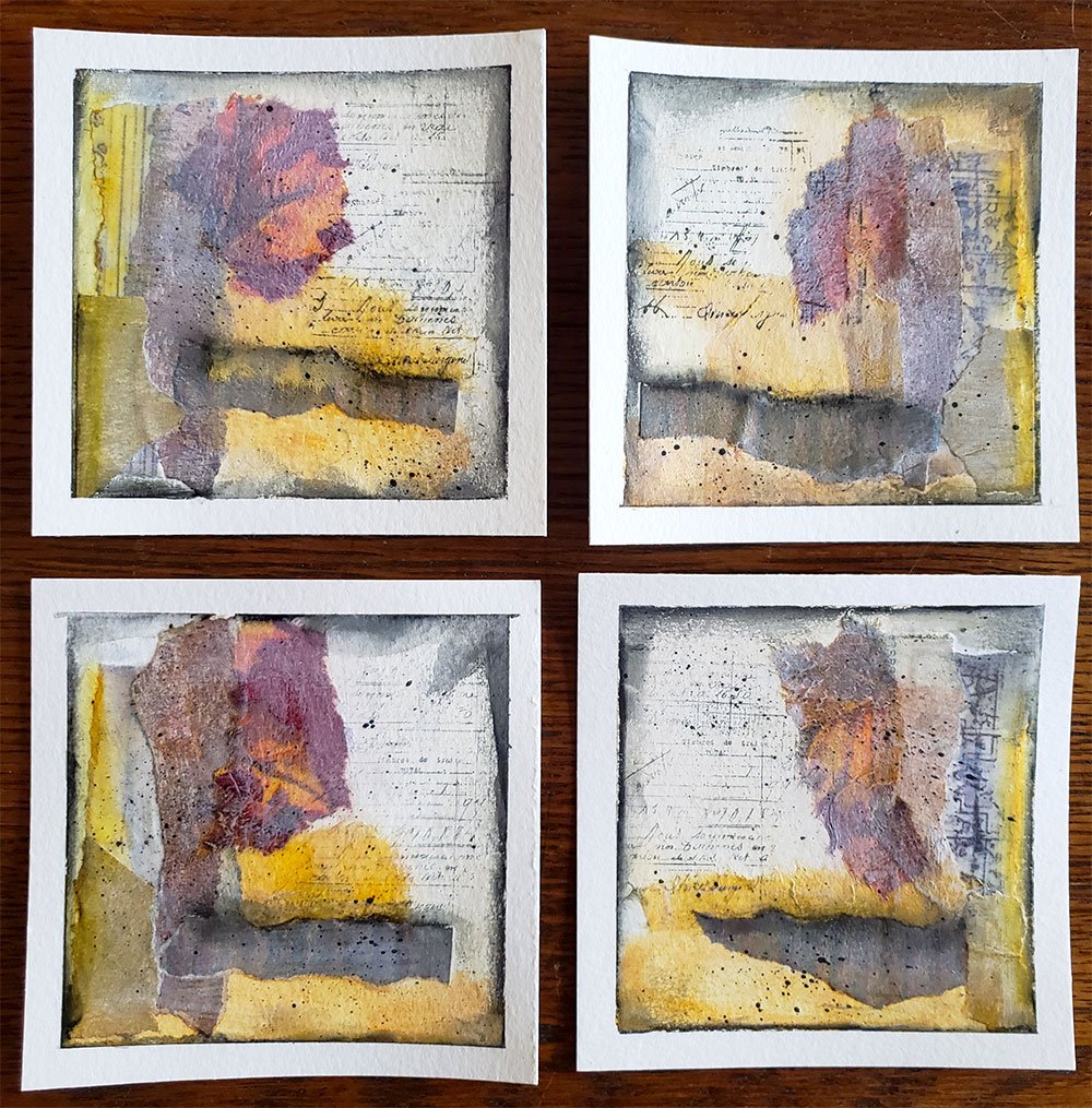
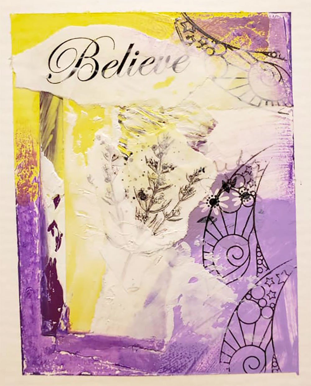
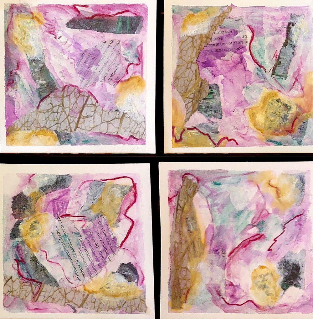
There’s something utterly magical about purple, especially the more intense kind. It’s a color you might not come across very much in your surroundings or in nature. Which is why it is such a show-stopper when it does show up!
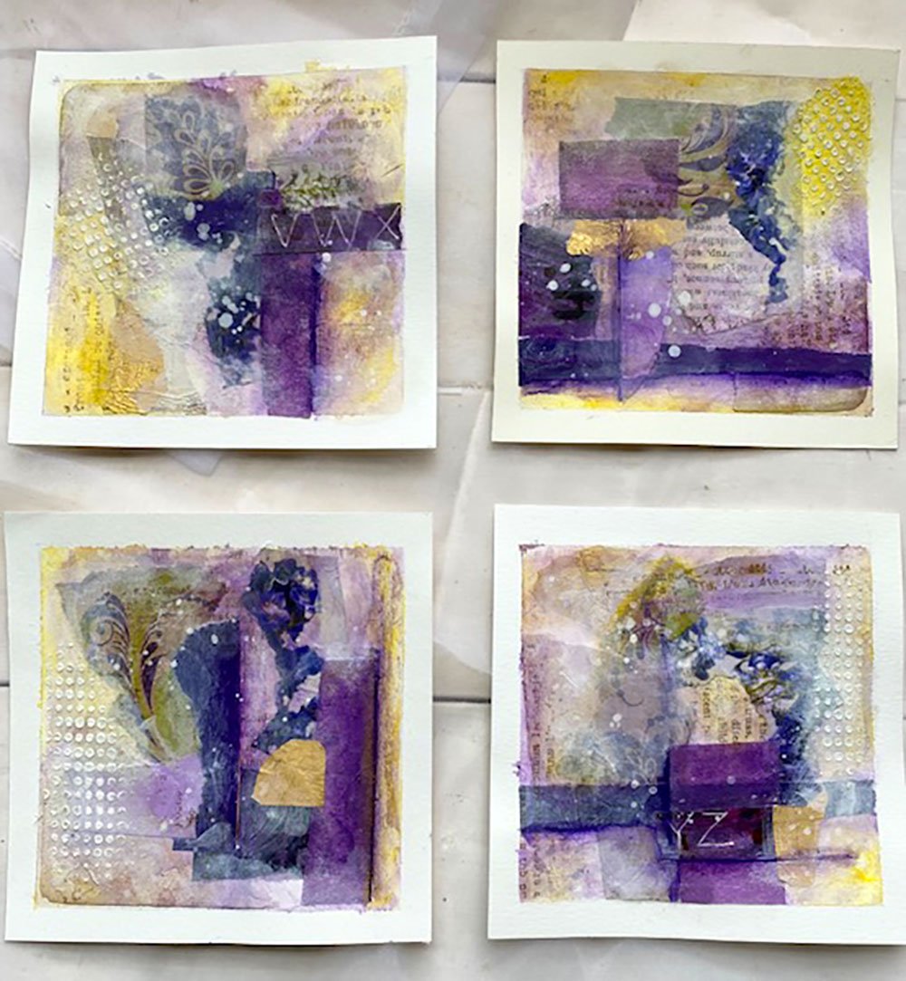
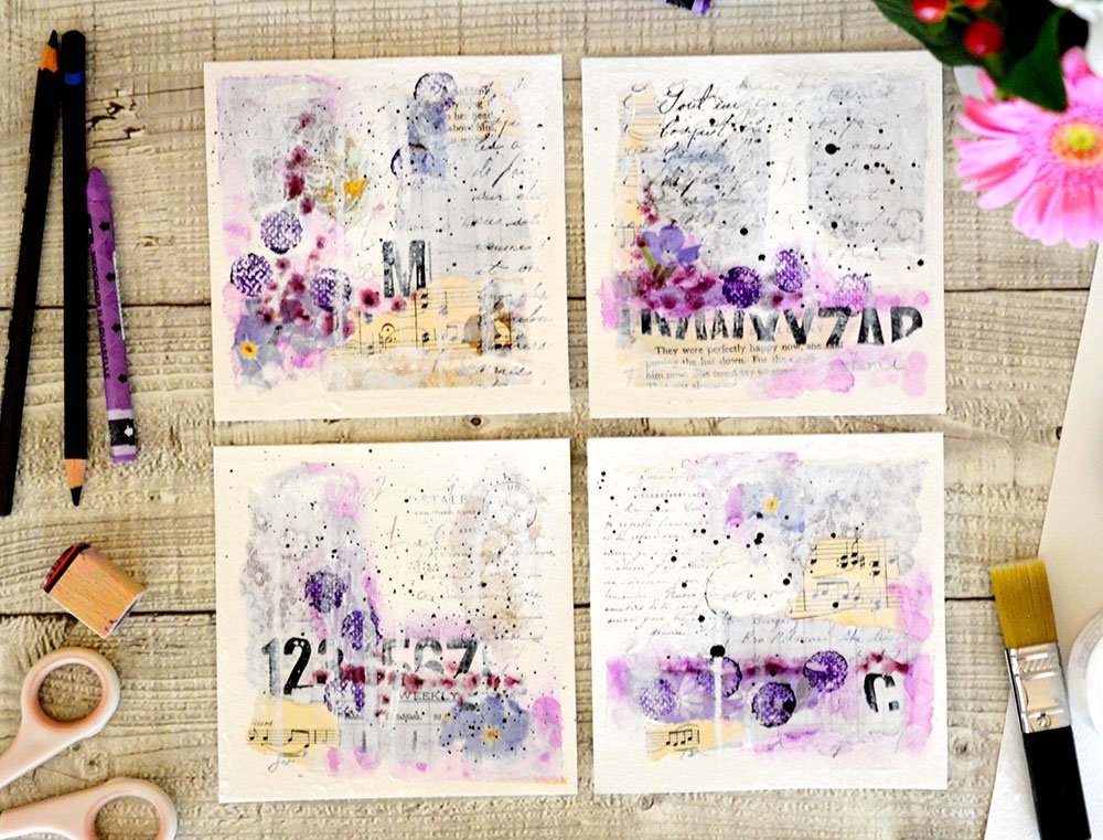
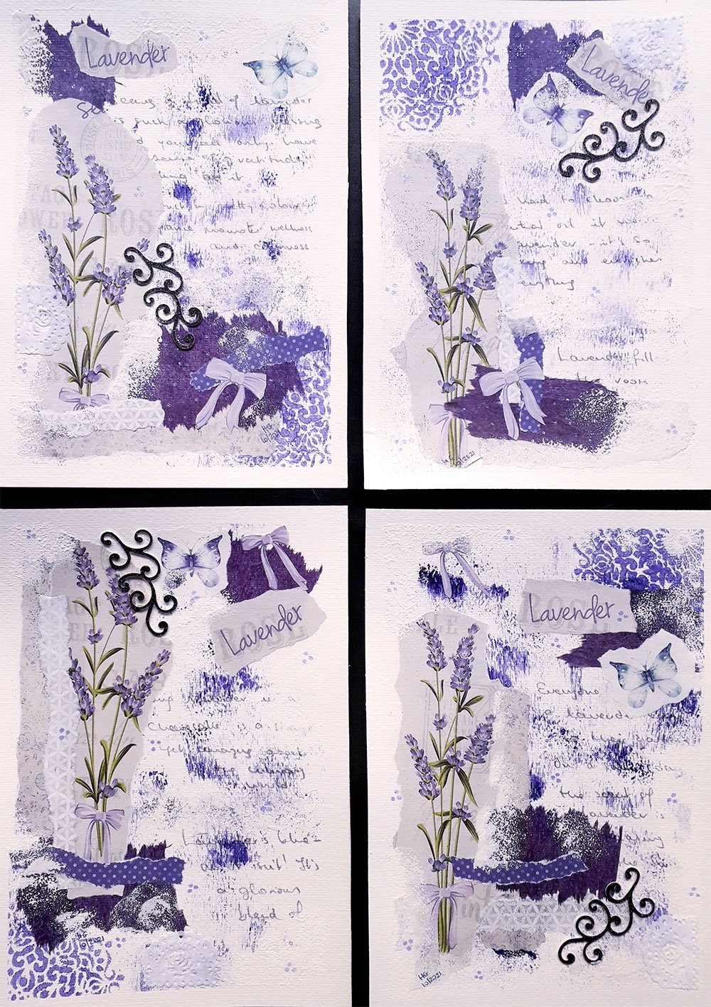
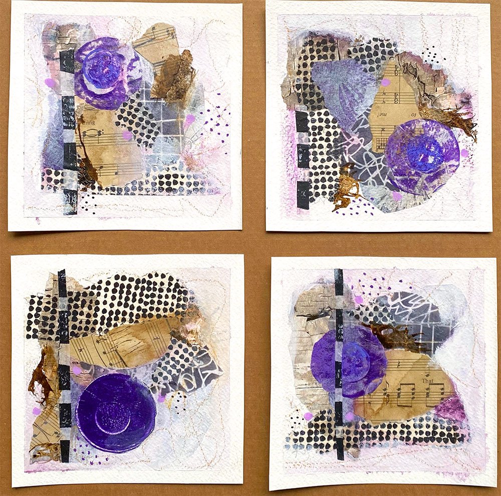
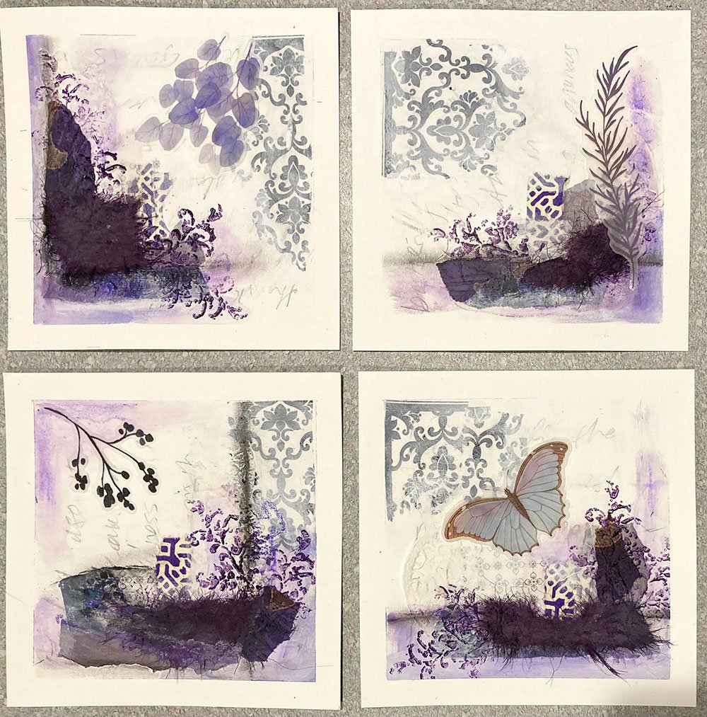
“Purple is one of my favourite colours but I haven’t used it in painting. So, I willingly used it in this challenge. I am SUPER proud of these 4 pictures, proud of myself and have found a way of expressing myself in such nurturing creative ways. Thank you so much! ”
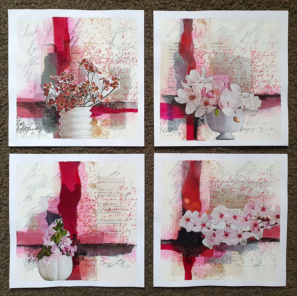
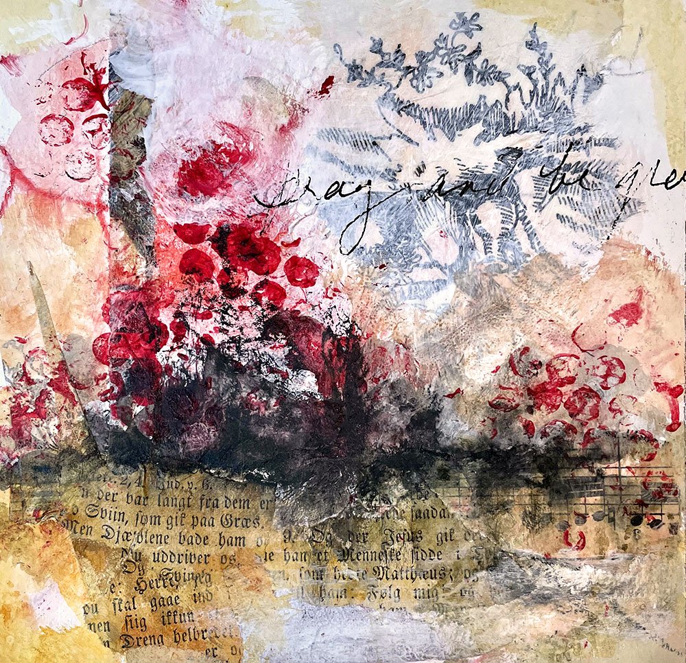
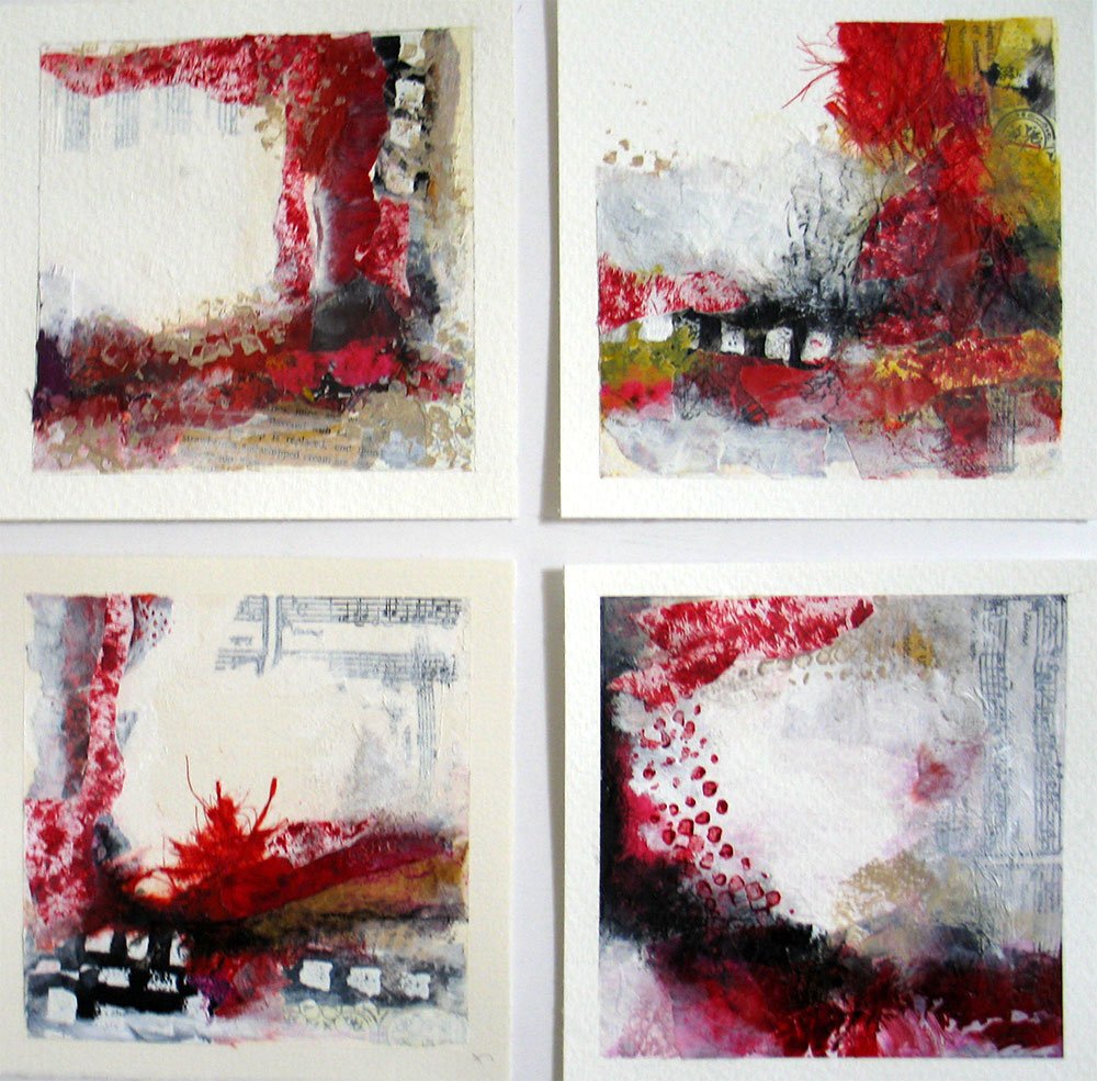
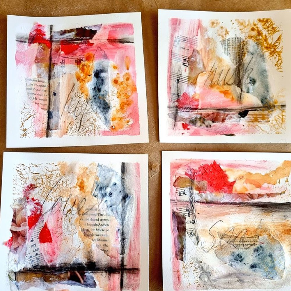
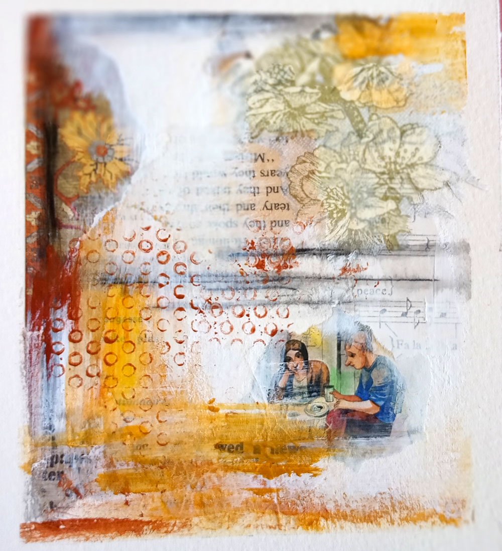
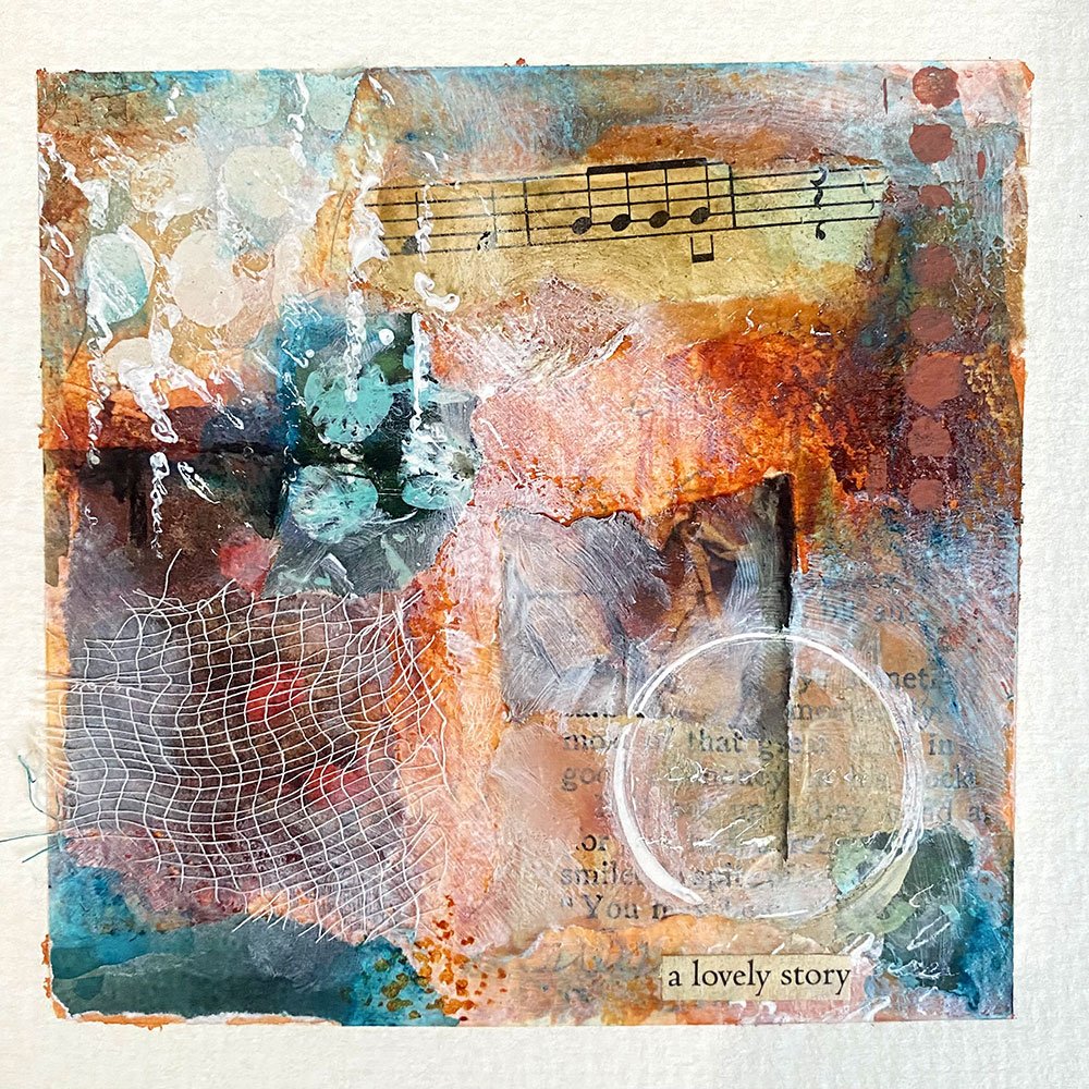
Is it red? Is it pink? Sometimes it leans towards burgundy or purple. There’s something highly subjective about the way we experience this color. Magenta is so rich and deep, yet as soon as you lighten it, with water or with white, you get soft, subtle pinks. It can be tricky, but it never fails to create a beautiful, feminine vibe.
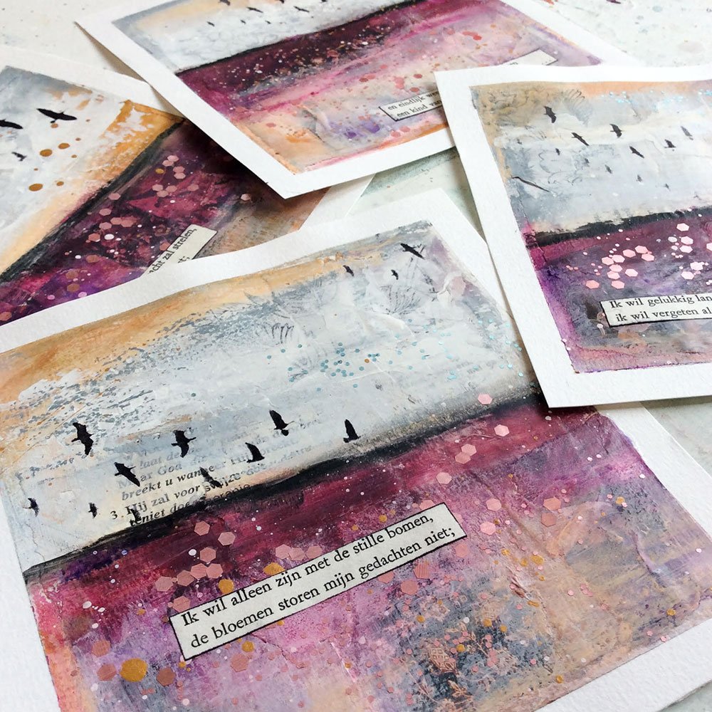
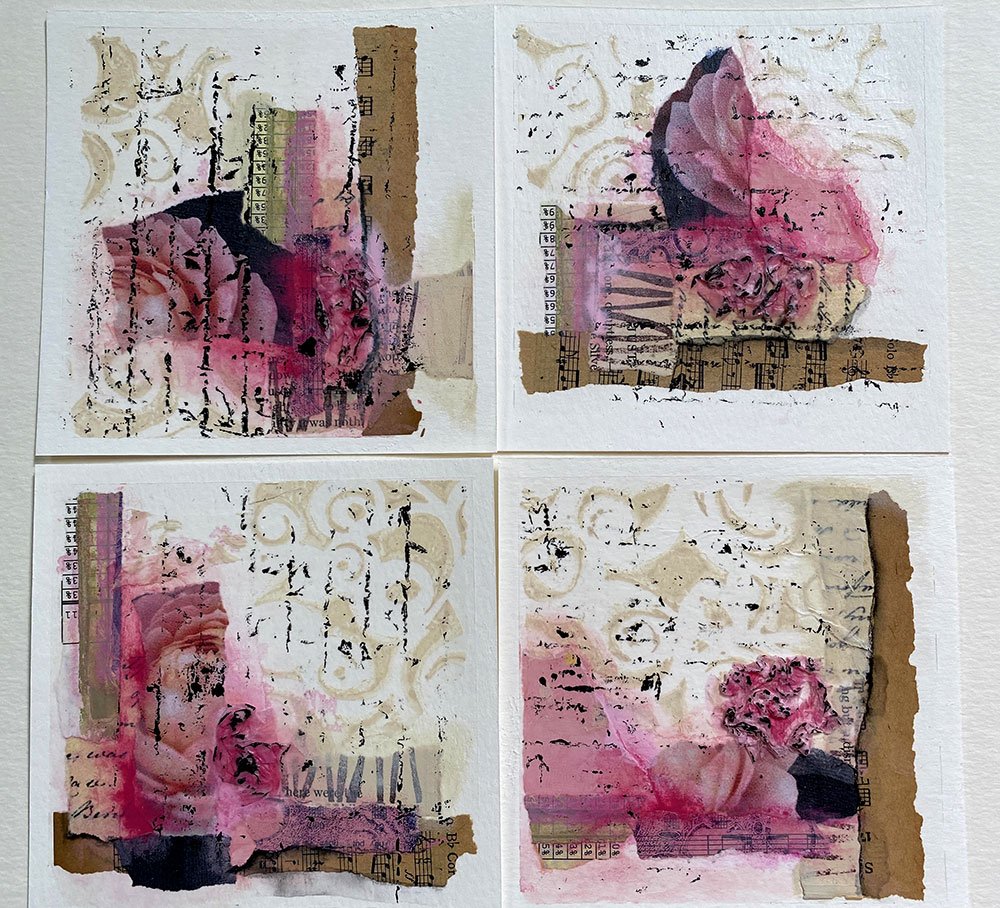
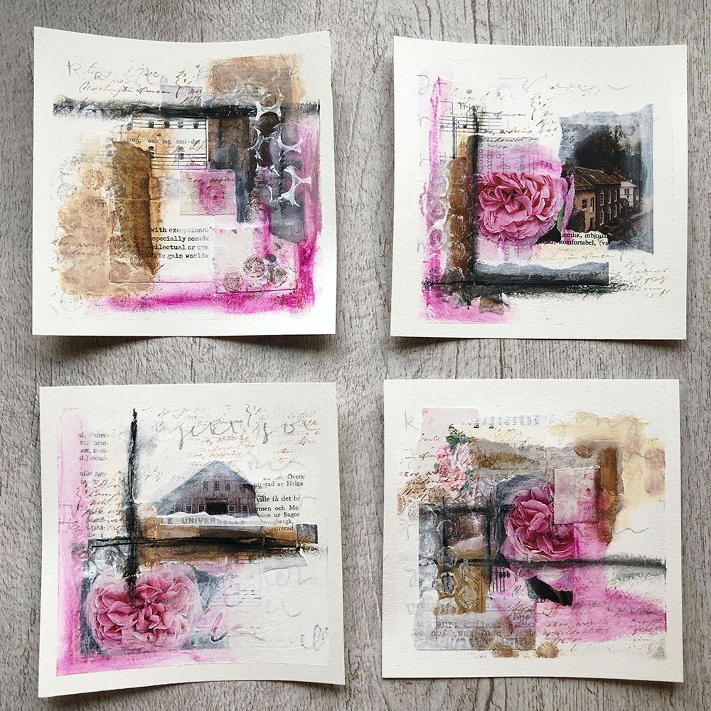
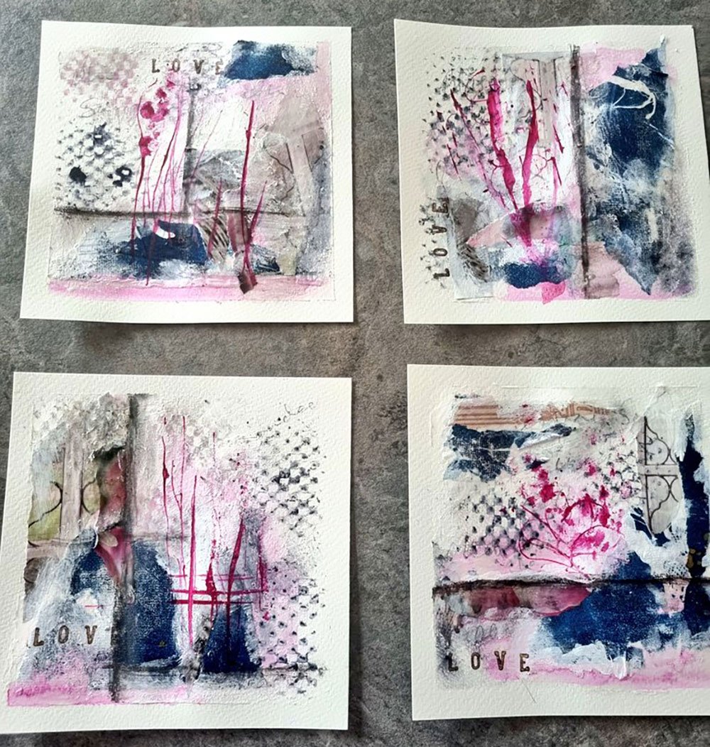
“I loved the abstract color challenge because I was able to do a canvas piece afterwards! With pink, unusual for me.”
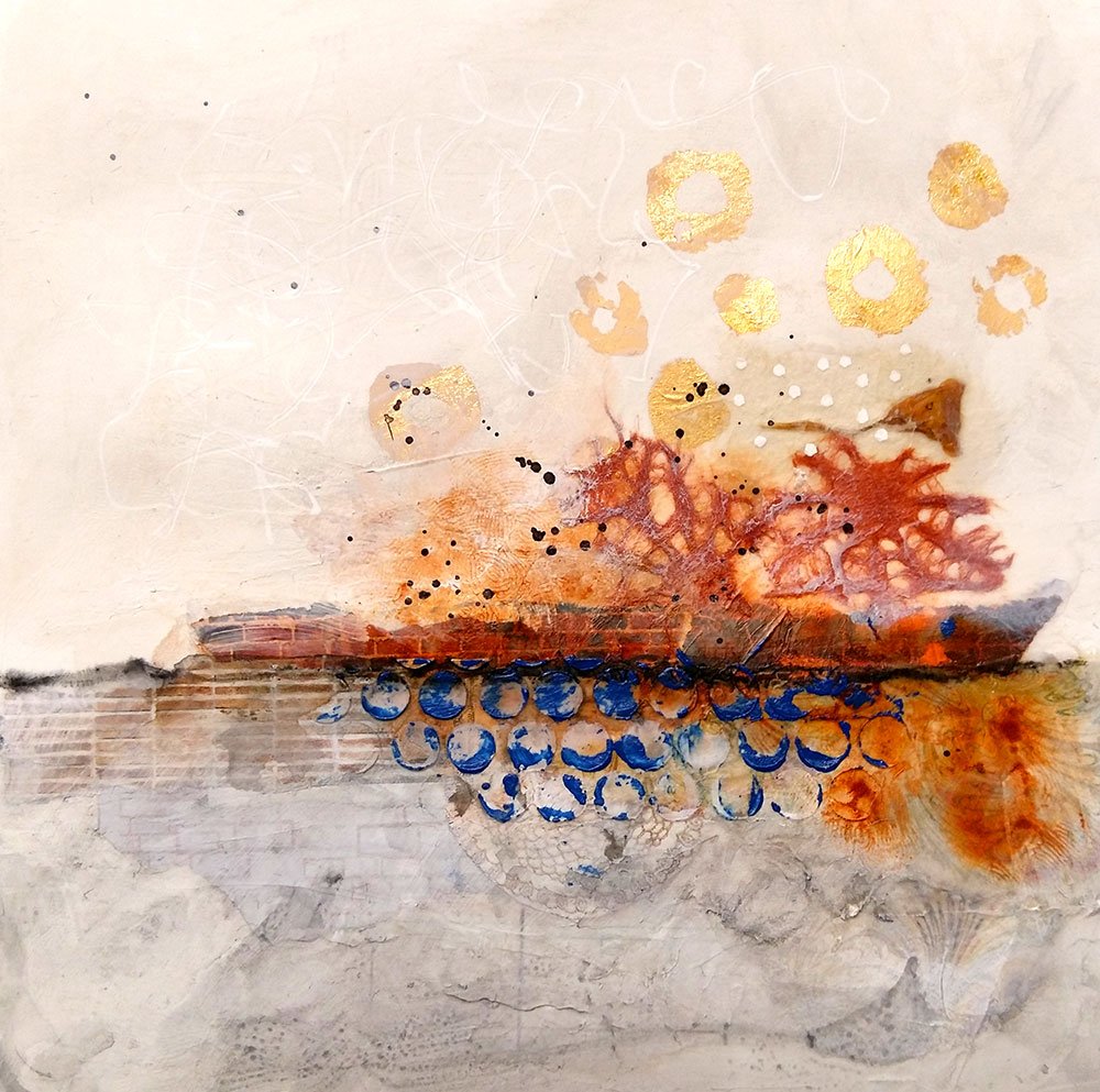
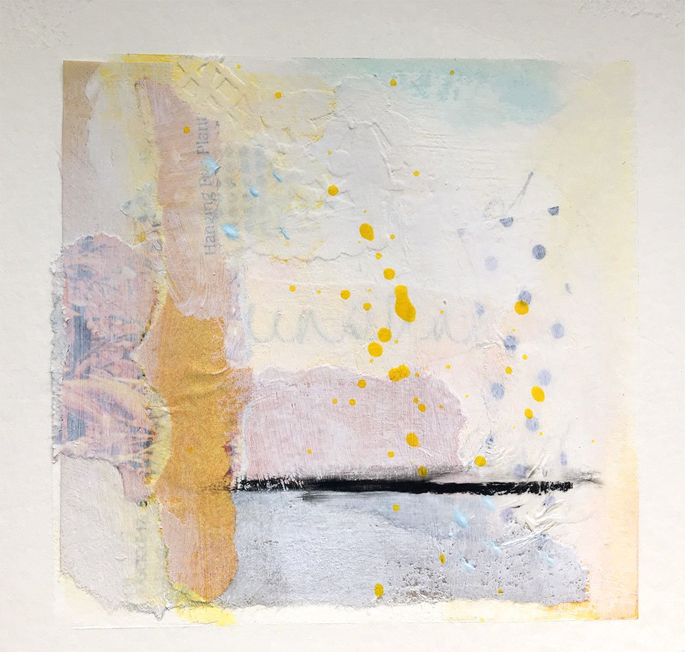
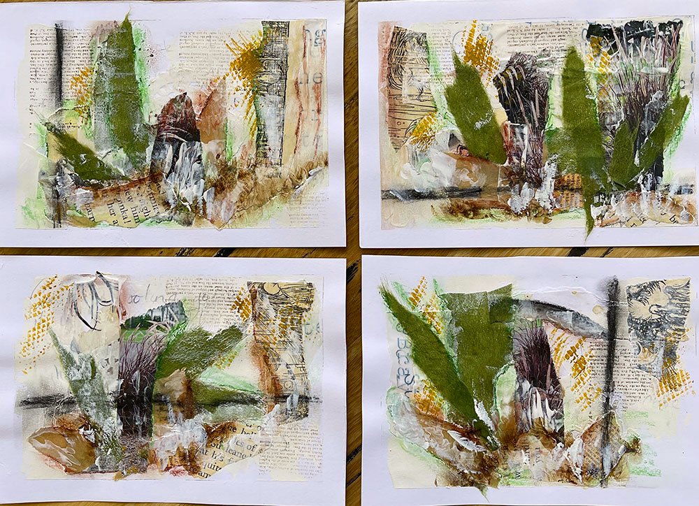
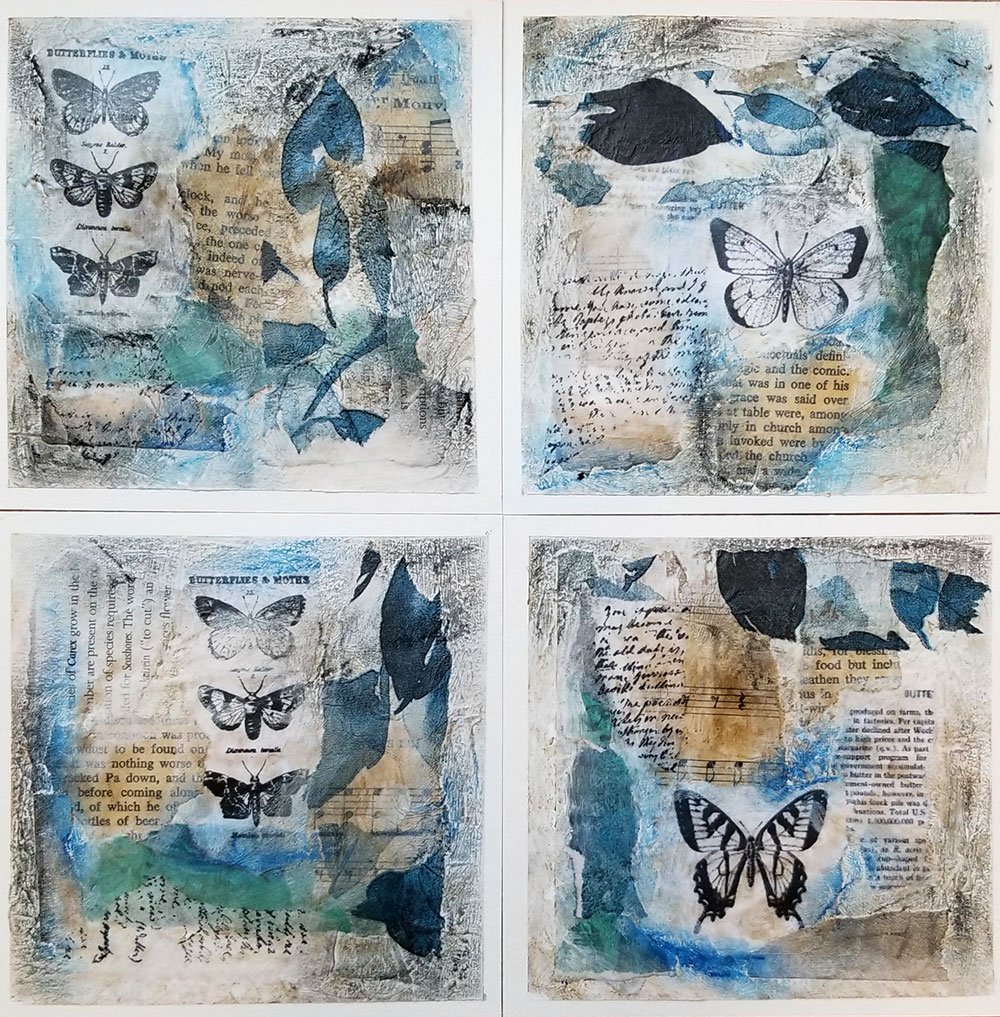
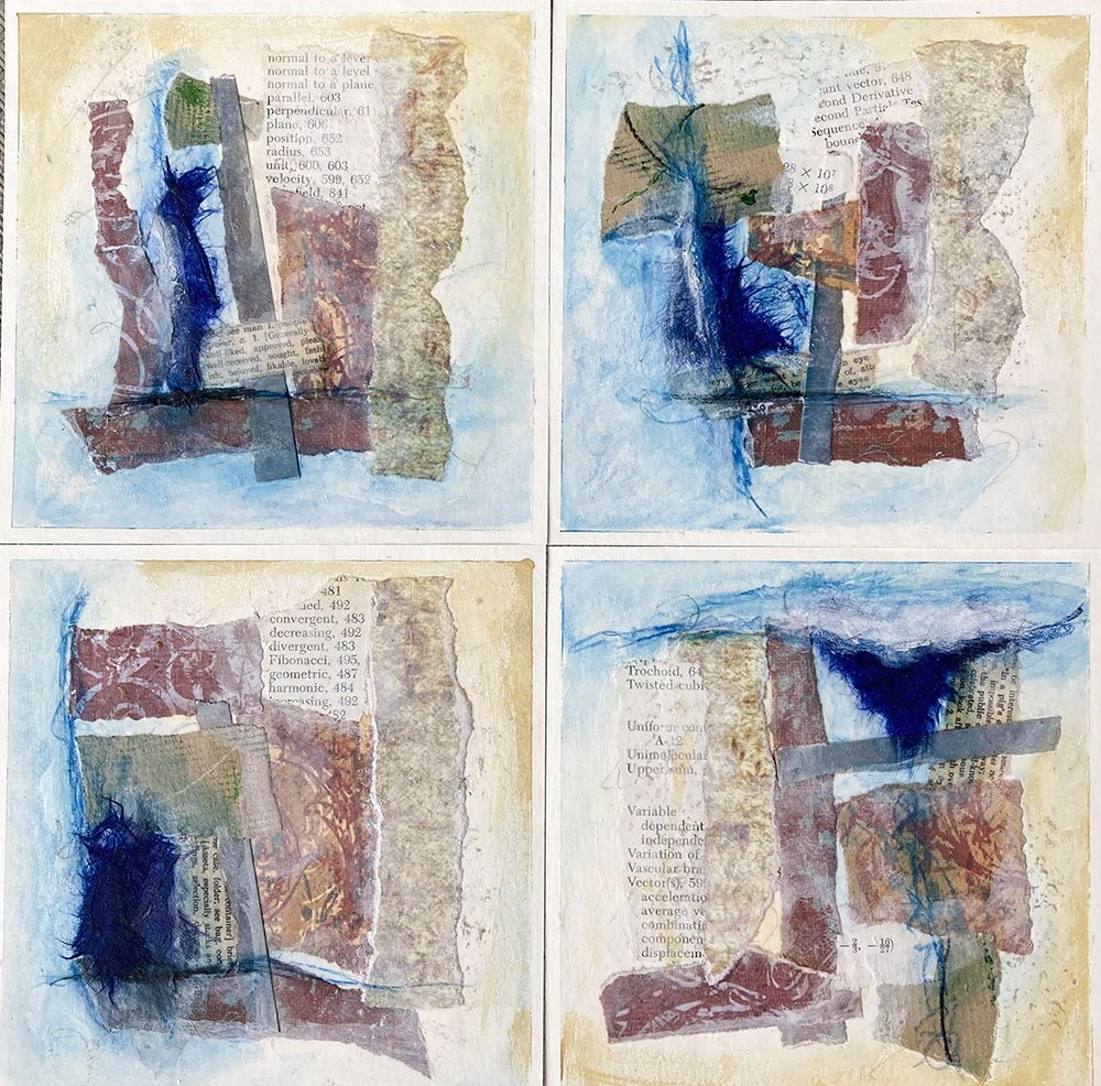
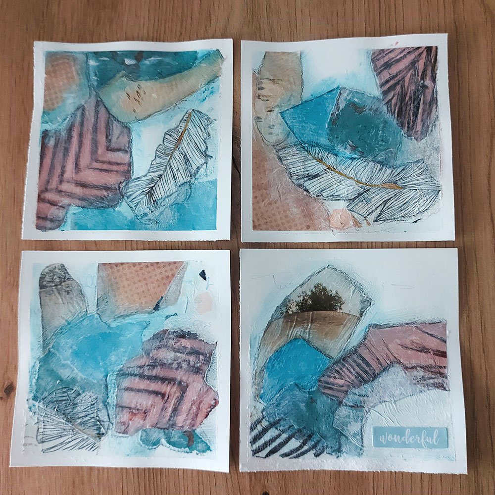
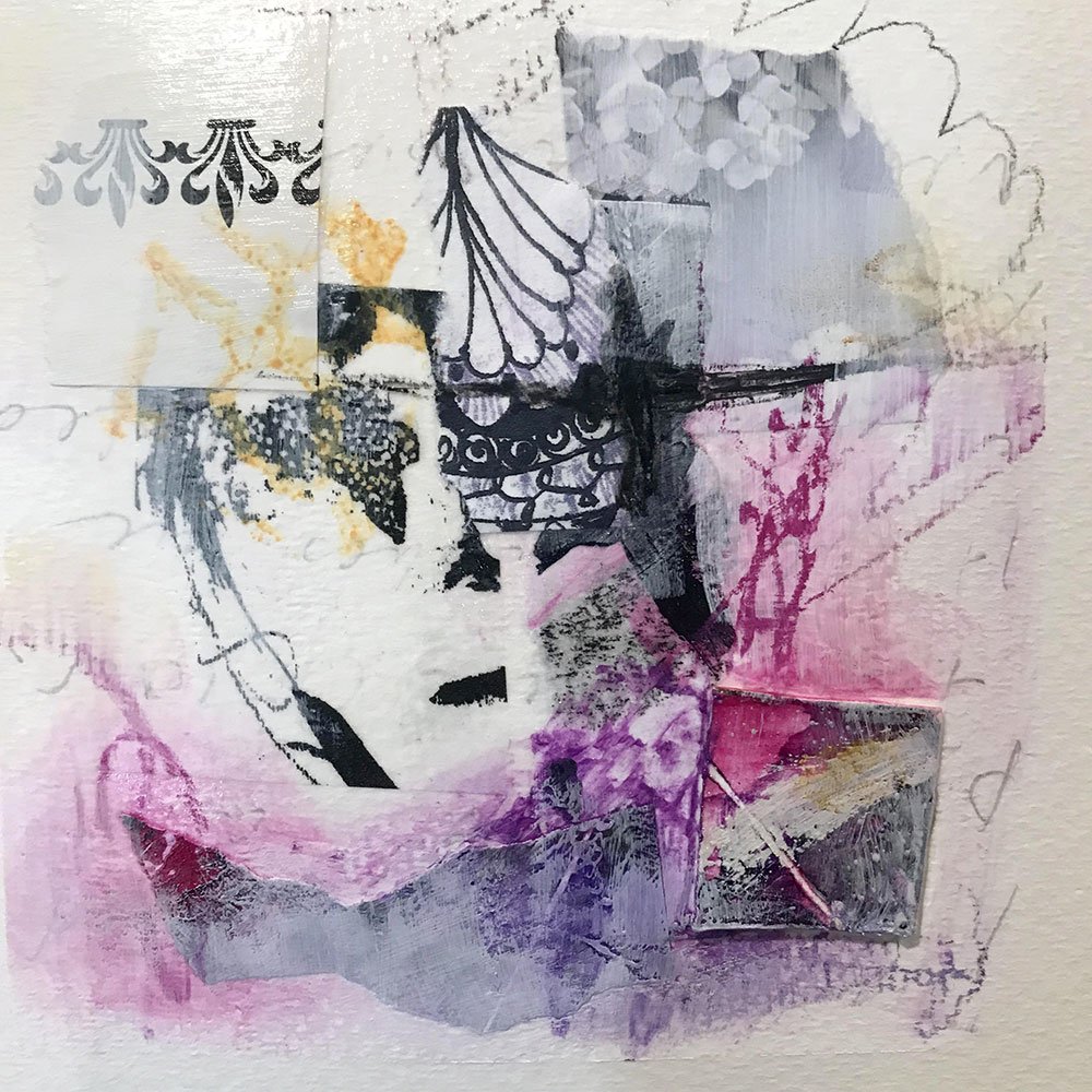
And finally, a few of you chose to work with neutrals. Yes they are colors too! From cool grays to warm browns and every shade of white, this is such an exciting palette to play with.
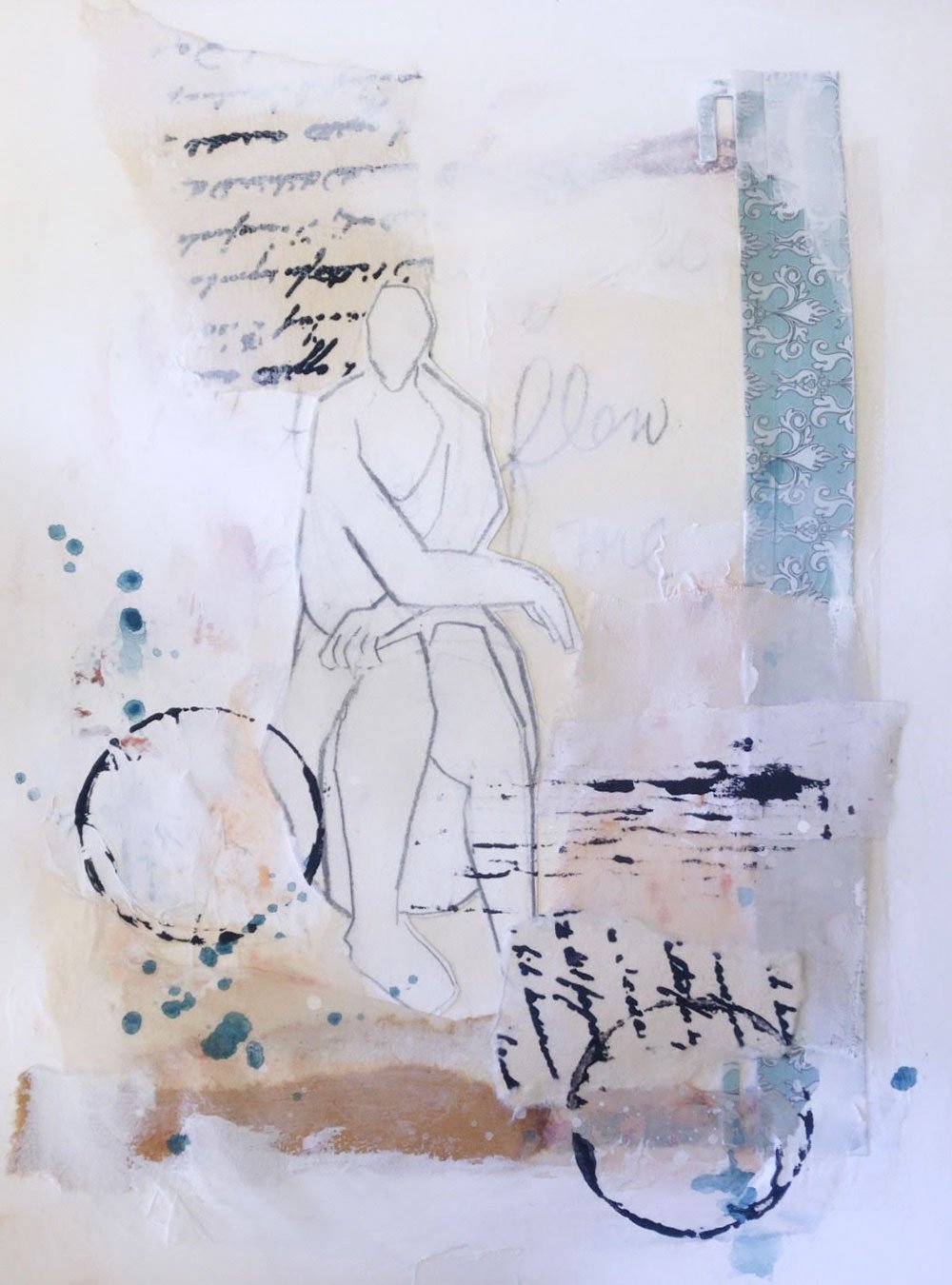
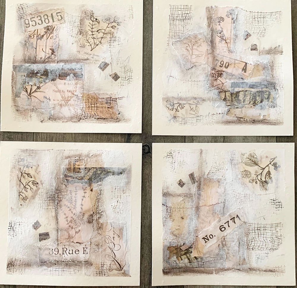
“I enjoyed pushing myself a bit to work with neutral colors that are typically outside my creative realm. ”
where the magic happens...
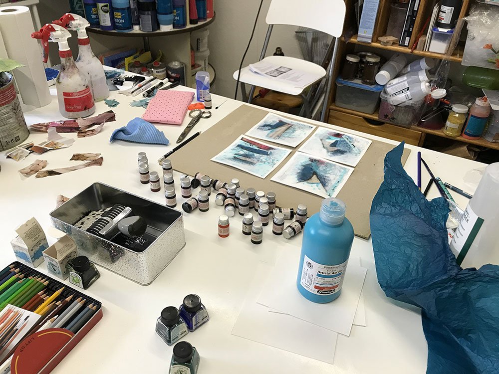
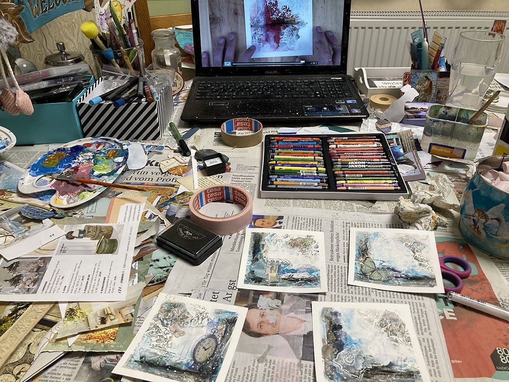
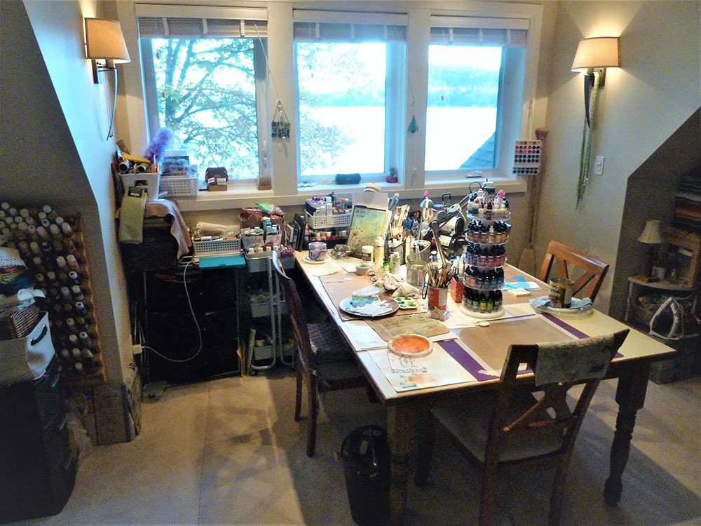
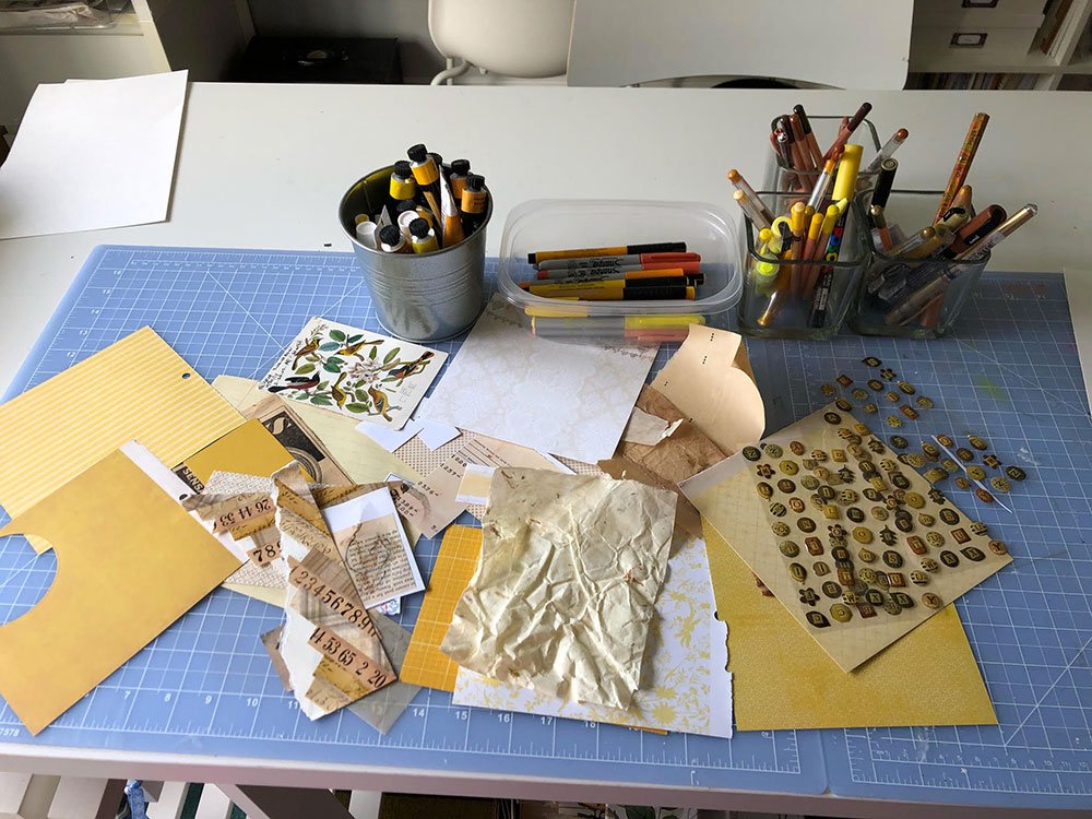
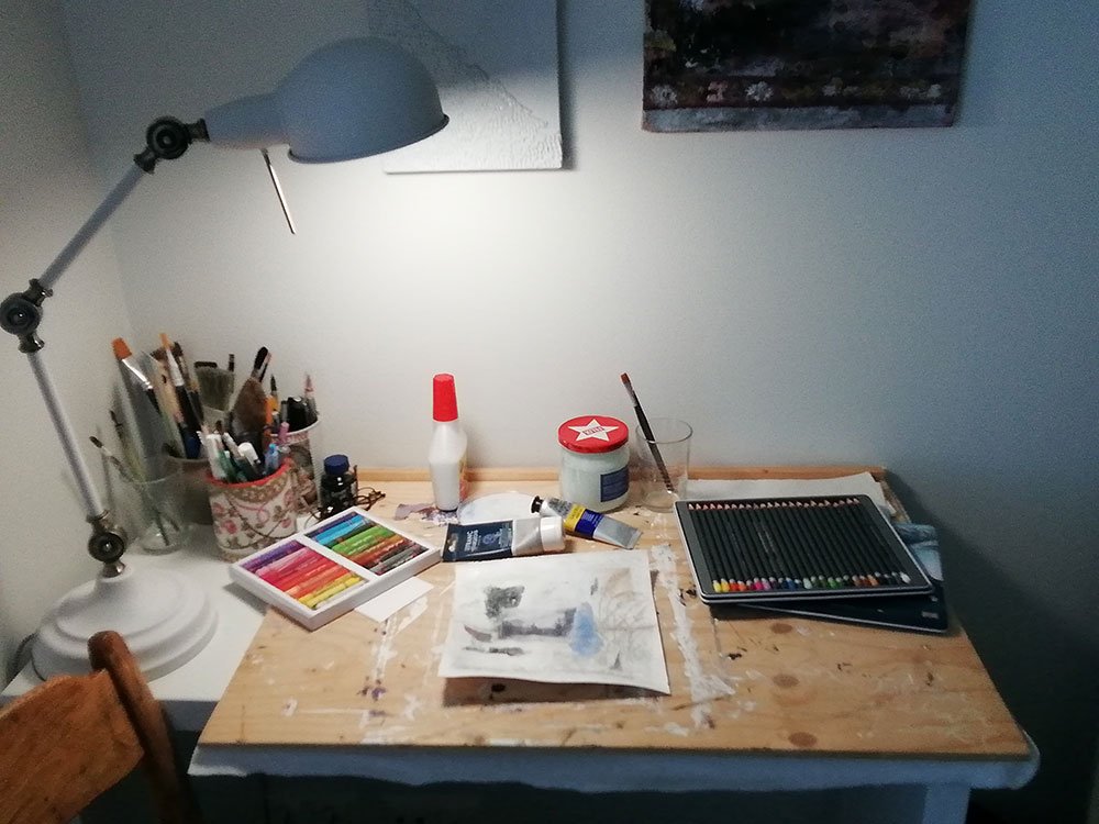
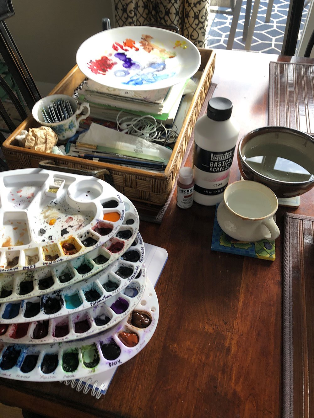
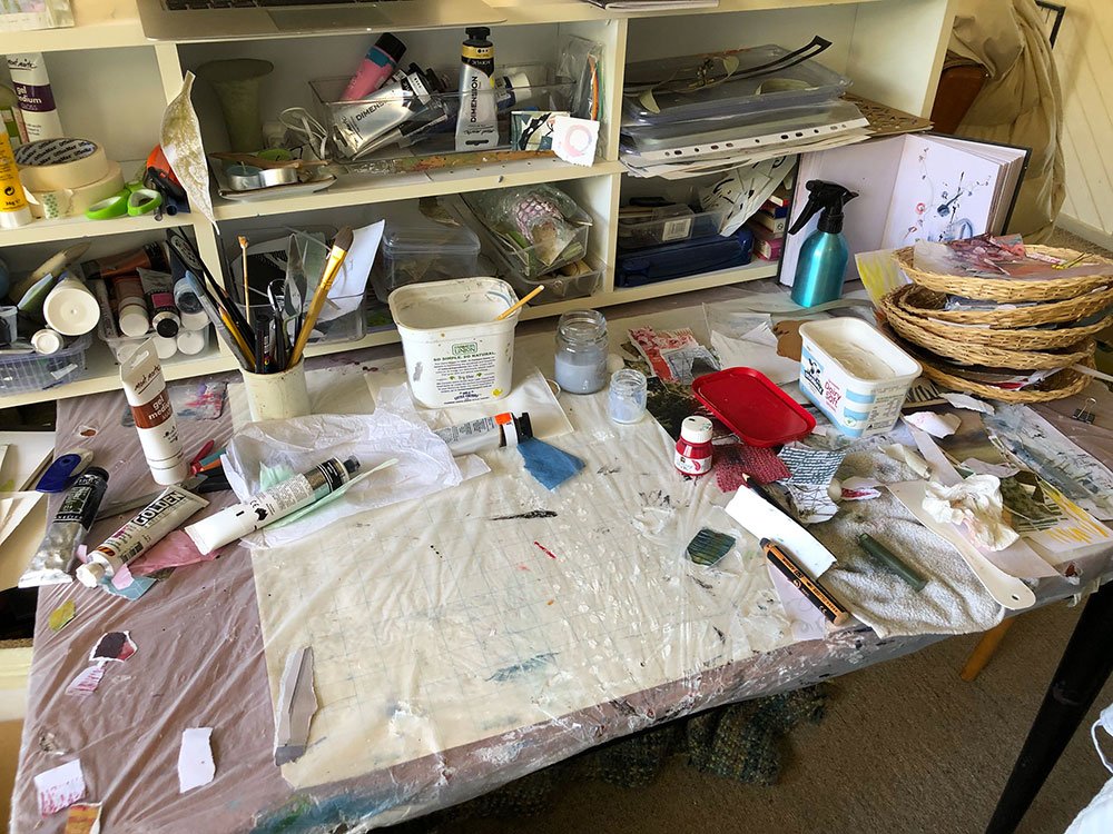
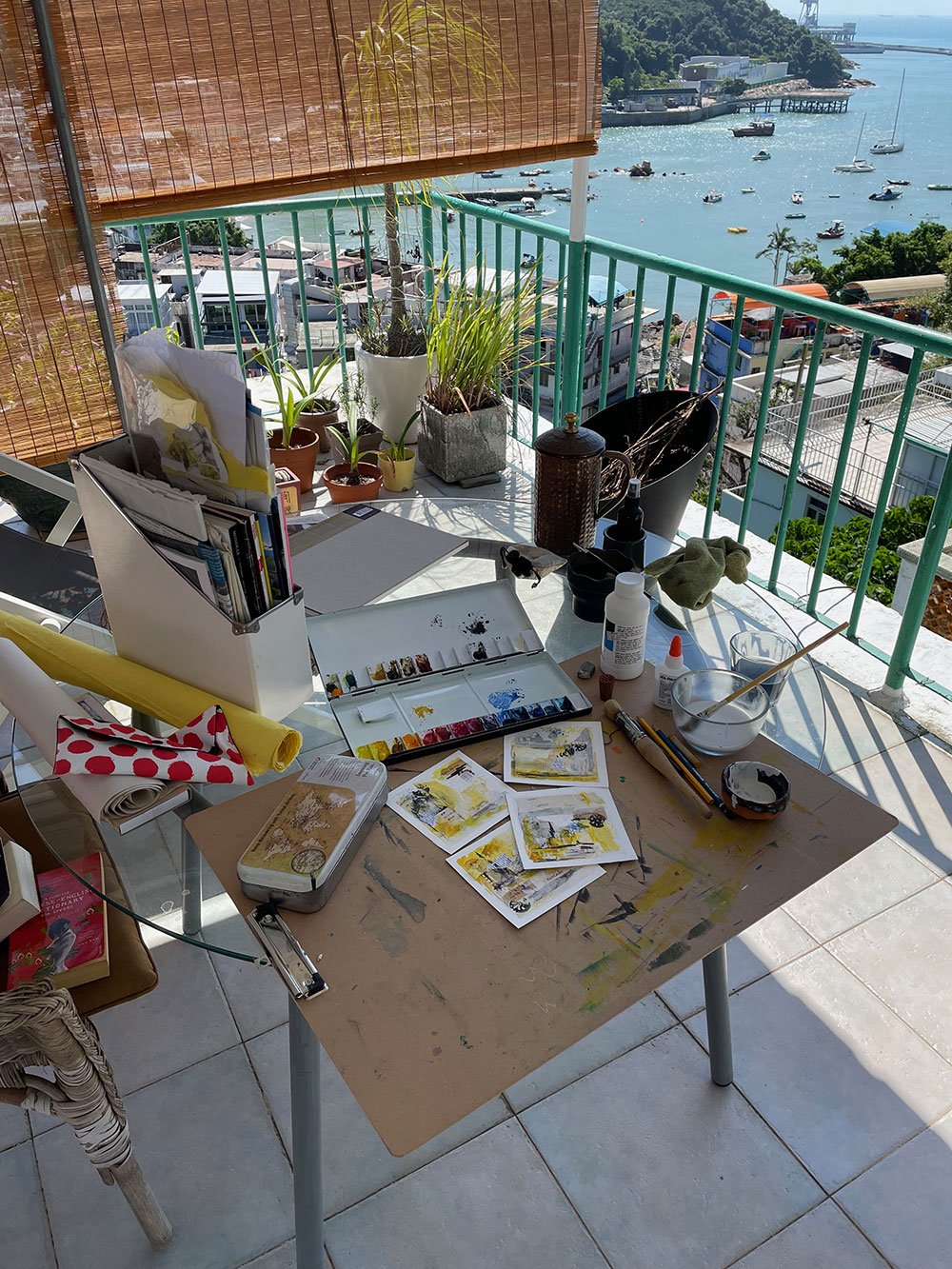
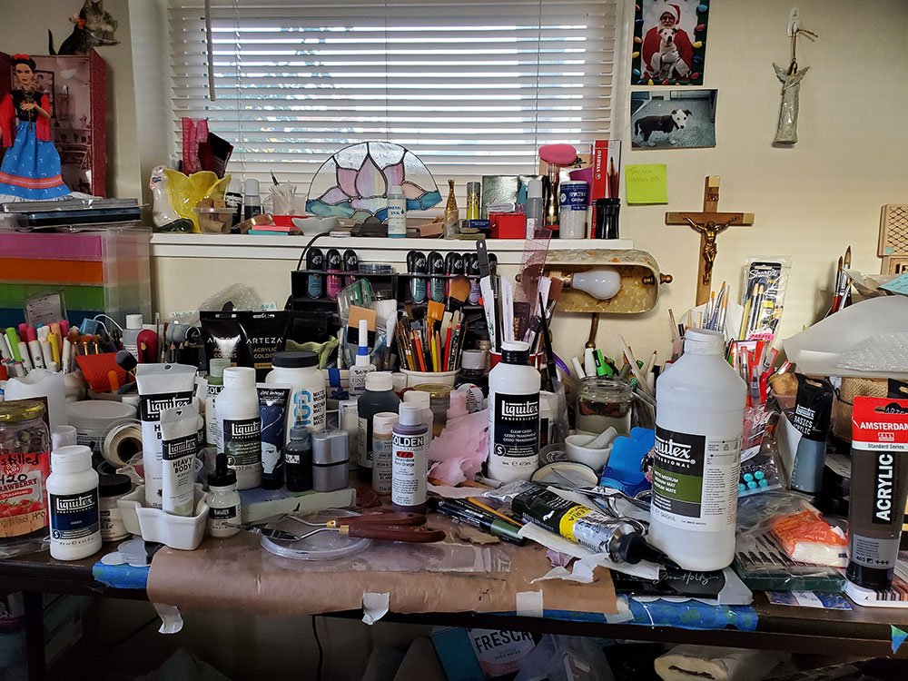
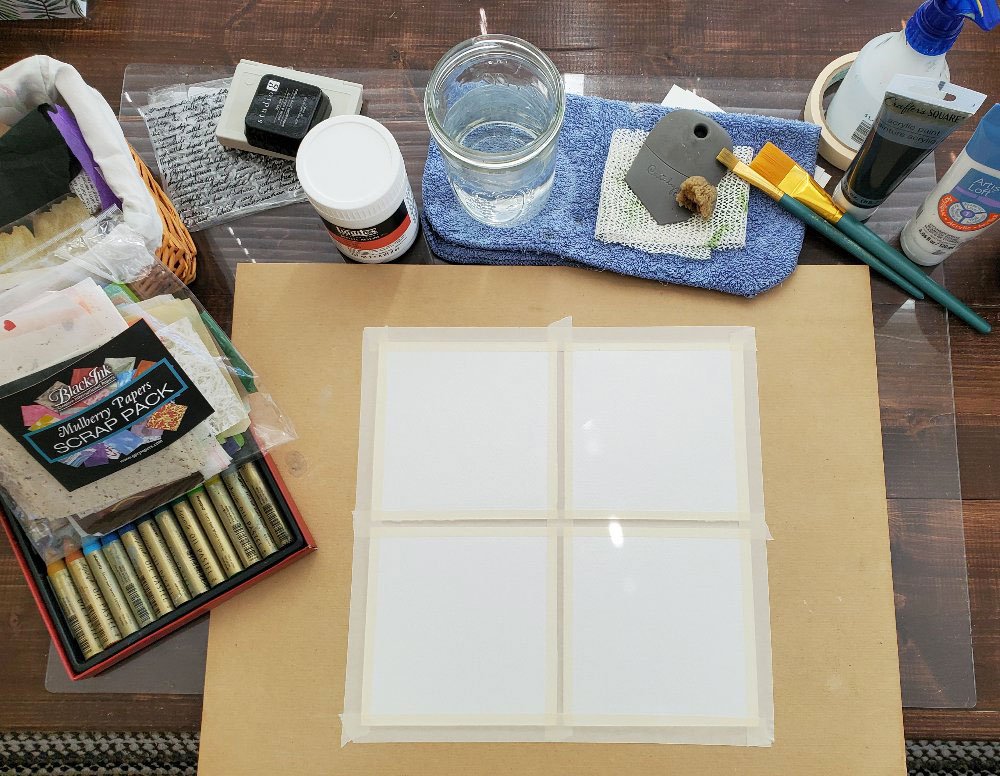
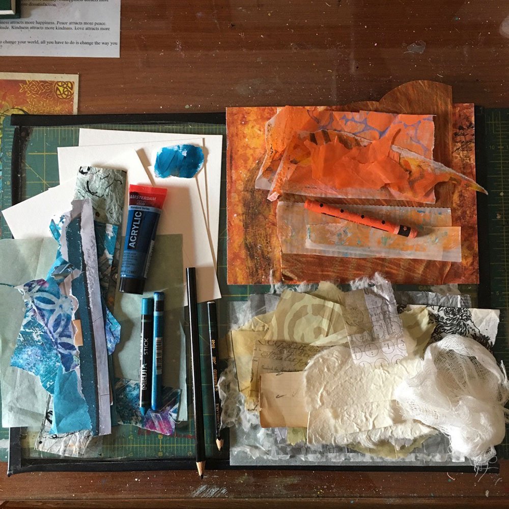
Sometimes I wish I were a little mouse to sneak into my students’ creative spaces! When I film an online class, I’m alone in my studio, and I can only imagine what it will be like “on the other side”, so it’s a real treat when you share pictures of your own space with me!
color courage
The whole point of this “challenge” was to create a series of mini artworks, or little studies, to explore a color you find beautiful but also a bit intimidating. And you did it!
When I asked you to tell me about your experience in this workshop, one of the things that came up again and again is that at some point, you didn’t like what you created and almost gave up. But with a bit of self-love and compassion, you still pushed through the discomfort and ended up really enjoying your results.


